Elections 2012: Coke vs. Pepsi

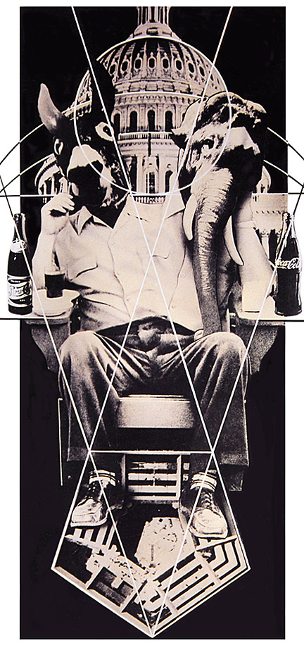
I love putting this image out every four years, it tickles me to no end. The photomontage Coca-Cola versus Pepsi-Cola, appears so modern from an aesthetic standpoint, not to mention up to date in a political sense. Scores of viewers will express disbelief over the artwork having been created in 1949.
That the artist responsible for the image, Josep Renau, was a Spaniard making comment on life in the U.S. while living in exile in Mexico, will also lead to dismay for some Americans. Then again, seeing as how U.S. presidential elections always end up impacting the global community in ways other national elections do not, one may perhaps excuse a foreigner for offering a view of the U.S. political process.
Renau wanted to convey the idea… not that the two dominant U.S. political parties were/are identical, but that they both serve the same interests. Conceivably that same point of view has today spread to many of us living in the continental United States, where it has become increasingly difficult to doubt that mega-billions now control the two parties and all of their politicians. The influence of advertising and marketing in the U.S. has left no aspect of life unaffected; that was certainly true when Renau made his observation, but it is even more so today.
At present it could be argued that marketers and monied interests hold sway over the democratic process itself. But in 1949 Renau understood that “culture” could be a primary method of social control, and he anticipated a time when it might also be a leading commodity peddled by corporations… these companies would comprise the “culture industry.”
Renau was no stranger to the importance of art in times of political turmoil. Born in 1907, he left his homeland in 1939 when the socialist Spanish Republic was overthrown by a fascist uprising led by General Francisco Franco and backed by fascist dictators Mussolini and Hitler; the event actually marked the beginning of the Second World War. In the chaotic years before this, the Spanish government appointed Renau the Director of Fine Arts in 1936, entrusting him with safeguarding the nation’s artistic treasures during the country’s bloody civil war. In 1937 Renau commissioned Pablo Picasso to paint the Guernica mural at the Spanish Pavilion at the “International Exposition dedicated to Art and Technology in Modern Life” held that year in Paris, France.
With the collapse of the Spanish Republic, the communist Renau went into exile in 1939. Like many thousands of Spaniards fleeing fascism he settled in Mexico. Immediately he befriended the muralist and fellow Stalinist David Alfaro Siqueiros, who had just received a commission from the Mexican Electricians’ Syndicate to paint a mural in the union’s Mexico City headquarters. Siqueiros brought together his “International Team of Plastic Artists,” including Renau, to assist in painting the mural Portrait of the Bourgeoisie. Renau would also earn a modest living designing posters for the Mexican film industry, a facet of his artistic production that I will address in a future essay.
But even as a leftwing artist steeped in the production of culture himself, Renau could never have imagined the length and breadth to which politics and marketing would become synonymous in the years after his 1982 death. In October of 2008 the publication Advertising Age named Barack Obama the “marketer of the year” for having successfully promoted the hope and change “brand.” Hundreds of advertising agency CEO’s attended the 2008 Association of National Advertisers conference and voted for Obama’s ad campaign over the effective marketing conducted by major corporations like Coors, Apple, and Nike. Advertising Age deemed the November 4, 2008 election the “biggest day in the history of marketing.” Indeed.

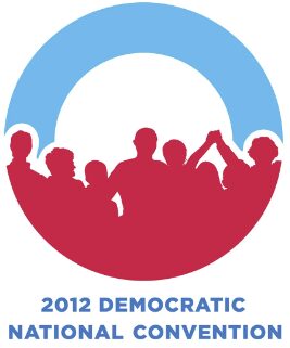
The conceptual “triumph” of brand Obama was accompanied by a visual style as well, which actually displaced the traditional Democratic Party iconography. I first noticed that the Democratic Party had dumped its traditional donkey mascot when I watched televised coverage of their 2012 Democratic National Convention in Charlotte, North Carolina. The emblematic donkey was nowhere to be seen, instead it had everywhere been replaced by a red, white, and blue circle design that bore more than a close resemblance to President Obama’s “O” logo. The actual party logo was difficult to find in the convention hall.
For no apparent reason, in 2010 the Democratic Party abandoned its traditional symbol of the red, white, and blue donkey for a new pictogram, a light blue “D” inside a darker blue circle. The bleak emblem has all the appeal of generic blue and white product packaging, and with just as much historic significance. While the donkey emblem was initially associated with Democratic presidential candidate Andrew Jackson in 1828, it was the celebrated political cartoonist Thomas Nast that transformed the donkey into the memorable insignia of the Democrats in a cartoon Harper’s Weekly published in 1870.
In Nast’s cartoon A Live Jackass Kicking a Dead Lion, the donkey represents the Copperheads, Americans who opposed the Civil War, blamed it on the Abolitionists, and wanted to negotiate peace with the Confederates. The donkey kicks a lion that represents Edwin Stanton, the anti-slavery lawyer who served President Lincoln as the US Secretary of War during most of the Civil War. The war ended in 1865 and Stanton died of ill health in 1869. Nast would also be responsible for casting the elephant as the symbol for the Republican Party in a cartoon Harper’s Weekly published in 1874.
My concern here is not the integrity of the Democratic Party, but rather that the abandonment of their long-established logo is yet another sign of the ahistoric postmodern condition that afflicts society. The Republicans have wisely held on to their traditional party symbol, while the Democrats have ditched theirs in favor of… bad typography.
If they continue with this aberrant behavior, I will no longer be able to trot out the Renau graphic every four years.

