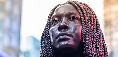
Journalism in Wonderland

The artist and his morning paper. "When I first laid eyes upon that horrid Times cover I remembered Oscar Wilde’s shrewd comments about the so-called fourth estate."

The artist and his morning paper. "When I first laid eyes upon that horrid Times cover I remembered Oscar Wilde’s shrewd comments about the so-called fourth estate."

The Los Angeles Times abandoned all pretense of being a serious newspaper guided by high journalistic standards, when on March 5, 2010 the daily ran a full color paid advertisement as its front page rather than headlines and photographs  from the news stories of the day.

It has been confirmed by the Hollywood news publication The Wrap, that the Walt Disney Company paid the Times approximately $700,000 to run a full color ad for the Disney-Tim Burton production of “Alice in Wonderland.”

The deal included not just the front page, but the inside front and back pages as well as the outside back cover of the publication.

Basically the entire newspaper was wrapped in an ad designed to look like an actual front page. A full color banner ad situated at the bottom of the paper’s genuine front page was also part of the deal, as was the incorporation of The Times masthead into the advertisement.

The March 5, 2010 front page of the Los Angeles Times. "Journalism: Down the Rabbit Hole."

The March 5, 2010 front page of the L.A. Times. "Journalism: Down the Rabbit Hole."

The spokesman for The Times, John Conroy, was quoted by The Wrap as saying the newspaper “worked very closely with Disney to come up with an exceptional and distinctive way to help them open Alice in Wonderland. It was designed to create buzz, and to extend the film’s already brilliant marketing campaign.” The New York Times quoted Conroy as saying that “It’s taking a concept that we normally apply to new media and reimaging it to a concept in a newspaper.”

What I find so appalling about the Times-Disney-Burton ad is its composition; it was laid over genuine news stories concerning President Obama’s healthcare “reforms” and his escalating war in Afghanistan. A gaudy photo of a heavily made up Johnnie Depp dressed as the demented Mad Hatter was superimposed over sobering news headings, partly obliterating them with the movie character’s top hat and flaming red hair. The underlying message, whether intentional or not, is clear; never mind those U.S. soldiers who are fighting, killing, and dying in Afghanistan – watch this movie.

"That the newspaper would proudly transform its entire front page into a commercial platform for the promotion of a frothy Hollywood triviality – as the nation fights two wars while in the throes of extreme economic crisis - perfectly illustrates the state of journalism in the United States today."

"The state of journalism in the United States today."

That the newspaper would proudly transform its entire front page into a commercial platform for the promotion of a frothy Hollywood triviality – as the nation fights two wars while in the throes of extreme economic crisis - perfectly illustrates the state of journalism in the United States today. The alternative title to this article might just as well have been, “Journalism: Down the Rabbit Hole.”

Apologists for The Times are quick to mention that the paper is a business like any other, and that a severe recession and changing media landscape justifies any and all schemes to bring in revenue. Why not then replace the paper’s Editorial page with advertisements designed to appear as editorial opinions, or perhaps cease publishing hard news stories altogether in favor of celebrity and human-interest reportage, already a lucrative trend for corporate news outlets. To rationalize The Times’ abject surrender to commercialism misses the point; a news gathering organization that is beholden to advertisers will edit and modify content in order to please those advertisers, it is naïve to think otherwise.

It must be remembered that the Tribune Company, a Chicago based media conglomerate owned by billionaire real estate tycoon Sam Zell, acquired the Times Mirror Company and the Los Angeles Times in June of 2000 for $8.3 billion. The Tribune Company’s annual revenue is approximately $5.73 billion a year, and Mr. Zell’s personal net worth has been estimated to be around $6 billion. The Tribune Company owns 10 newspapers (including the Times and the second largest Spanish language paper in the U.S., Hoy), over 20 television stations (including L.A.’s KTLA), the WGN radio station in Chicago, and a number of other media assets that includes Chicago magazine and the Advocate Weekly Newspapers.

Under Zell’s ownership the Times has suffered massive staff cuts, with more than 300 newsroom personal laid off. The paper’s editor, James E. O’Shea, was fired in 2008 for resisting staff cuts. In 2009 the paper’s “California” section was done away with, eliminating the publication’s long established local news desk. It was then decided to fold local news into the paper’s front section – which was reorganized to de-emphasize national and international news. In a 2008 column for the Washington Post titled, The L.A. Times’s Human Wrecking Ball, journalist Harold Meyerson castigated Zell for being a “visiting Visigoth,” noting that the tycoon thought:

“there was too much coverage of world and national affairs, he told Times writers and editors; readers don’t want that stuff. Last week, the company decreed that its 12 papers would have to cut by 500 the number of pages they devoted every week to news, features and editorials, until the ratio of pages devoted to copy and pages devoted to advertising was a nice, even 1 to 1. At the Times, that would mean eliminating 82 pages a week.

(….) Voluntarily or not, large numbers of highly talented editors and reporters have left. The editorial staff is about two-thirds its size in the late 1990s, with further deep cuts in the offing. A paper that is both an axiom and an ornament of Los Angeles life, that helps set the political, business and artistic agenda for one of America’s two great world metropolises, is being shrunk and, if Zell continues to get his way, dumbed down.”

Observably, the Alice in Wonderland front page ad debacle is the ultimate expression of the dumbing down Meyerson forewarned of, and the Los Angeles Times has thoroughly trivialized and degraded journalism with the stunt. To be fair, the degeneration of the Times is part and parcel of the overall collapse of journalism in the U.S., as corporate news outlets abandon investigative journalism and insightful reporting on national and international affairs, for stories about car chases, the lives of celebrities, puppies, and other deadening inconsequentialities.

There is however another way of looking at the predicament; corporate “journalism” is not at all deteriorating, but fulfilling its mission of obfuscating and distracting. In his 1891 essay, The Soul of Man under Socialism, the writer and aesthete Oscar Wilde made an observation regarding the role of journalism that is pertinent to the topic at hand:

What is there behind the leading article but prejudice, stupidity, cant, and twaddle? And when these four are joined together they make a terrible force, and constitute the new authority. In old days men had the rack. Now they have the press. This is an improvement certainly. But still it is very bad, and wrong, and demoralizing. Somebody – was it Burke? – called journalism the fourth estate. That was true at the time, no doubt. But at the present moment it is the only estate. It has eaten up the other three (….) In America the President reigns for four years, and Journalism governs for ever and ever.

One can only imagine the caustic remarks Wilde would send flying at Sam Zell and the other potentates behind today’s 21st century media circus. When I first laid eyes upon that horrid Times cover I remembered Wilde’s shrewd comments about the so-called fourth estate, but I also thought back to an even more trenchant criticism of the press, a photomontage made in 1930 by the German artist John Heartfield, whose works regularly appeared in the pages of the left-wing Arbeiter-Illustrierte Zeitung (AIZ - Workers’ Illustrated Magazine).

 "Whoever Reads Bourgeois Newspapers Becomes Blind and Deaf: Away with These Stultifying Bandages!" - John Heartfield. Photomontage. 1930. © Artists Rights Society (ARS), New York / VG Bild-Kunst, Bonn.

"Whoever Reads Bourgeois Newspapers Becomes Blind and Deaf: Away with These Stultifying Bandages!" - John Heartfield. Photomontage. 1930. © Artists Rights Society (ARS), New York / VG Bild-Kunst, Bonn.

Heartfield’s image depicted a man whose head was wrapped in the front pages of the two leading German Social Democratic newspapers of the day, Vorwärts (Forwards) and Tempo, the man’s swathed head being made to look like a cabbage. Heartfield placed text over the image that chided the Social Democrats for their centrist politics and accommodationist stance regarding Germany’s ruling class. The mocking caption was a parody of a Prussian patriotic song, “I am Prussian. Do you know my colors?” (which mentions the colors of the German flag), further linking the Social Democrats to the powers that be. Translated from German, Heartfield’s caption ran as follows:

“I am a cabbagehead. Do you know my leaves? I’m nearly out of my mind with worries, but I keep my mouth shut and hope for a savior. I want to be a black-red-and-gold cabbagehead! I don’t want to see anything, or hear anything, or get mixed up in public affairs. And you can take everything, even the shirt on my back, yet, I won’t let the Red press into my home!”

Along the bottom of the photomontage, Heartfield placed the following caption in bold text; “Whoever reads bourgeois newspapers becomes blind and deaf. Away with stultifying bandages!”

Millard Sheets: The Early Years

Millard Sheets: The Early Years (1926-1944), on display at the Pasadena Museum of California Art (PMCA) through May 30, 2010, is an important exhibit of works by a leading California exponent of the “American Scene” painters, those artists given to documenting ordinary Americans going about their everyday lives.

Incorporated into the American Scene genre were the subcategories of “Regionalism” and “Social Realism.” The former concentrated on themes of local life in small town rural settings, the later engaged in works of social criticism, focusing on the experiences of working people in urban settings. Depending on the artist, there could be much overlap between the three schools, and Sheets was one to blend them without difficulty; Social Realism ran through his early works. Given my interest in that genre, and feeling it best describes what I am attempting in my own artworks, I enthusiastically attended the exhibition and now proffer the following comments regarding it.

The first painting one sees when entering the museum is Abandoned, Sheets’ 1933 canvas that has come to symbolize the Great Depression. At first glance the focus of the work seems to be the wild and uncontrollable forces of nature, there is a spiritual quality to the painting, however, a second glance unveils an ominous, darker narrative. Under a forebodingly turbulent sky, horses move through a tangle of overgrown brush and fallen trees. The eye finally rests on a dilapidated windmill, and only then do the deserted farm buildings come into focus, as does the real meaning of the painting. It is a representation of American society brought to its knees by economic collapse, where even the family farm – iconic national symbol of self-reliance – has come to ruin. The mystical sense of the canvas dissolves into the brutal material reality that people were driven from the land and their properties repossessed by  banks, a story that has once again become sadly familiar to millions of Americans.

"Abandoned" – Millard Sheets. 1933. Oil on canvas. This painting of an abandoned farm has come to symbolize the Great Depression.

"Abandoned" – Millard Sheets. 1933. Oil on canvas. This painting of an abandoned farm has come to symbolize the Great Depression.

Aesthetically speaking, Abandoned is a highly polished and sophisticated painting with a finish that displays few brushstrokes. It is a work that was planned out well in advance, despite its energetic and spontaneous look. Sheets eschewed detail to concentrate on form and composition, and here it is obvious that far from being a conservative painter, he was utilizing abstraction and Modernist aesthetics. One last note regarding Abandoned. While it is generally thought of as a Social Realist comment on depression era America, an interpretation I subscribe to, in reality the artist was inspired to create his canvas after seeing an abandoned farm in Riverside, California. The farm was marked for destruction so that the U.S. Army Corps of Engineers could build the Prado Dam flood control system.

Terminal Island Fish Harbor – Millard Sheets. 1935. Oil on canvas. Here the artist gives us a glimpse of the traditional West coast fishing industry as it existed at Terminal Island in San Pedro, California before the outbreak of WWI.

"Terminal Island Fish Harbor" – Millard Sheets. 1935. Oil on canvas. Here the artist gives us a glimpse of the West coast fishing industry as it existed at Terminal Island in San Pedro, California before the outbreak of WWII.

Terminal Island Fish Harbor is a painting that immediately caught my eye. No reproduction could possibly do justice to this extraordinary work depicting a historic harbor near Long Beach, California.

Sheets managed to capture the fading light of a California sunset with incredible accuracy, the golden light illuminating a scene of fisherman at their work.

The dominant palette is hot; pastel yellows, oranges, and reds, brilliantly counterpoised by the cool blues of deep harbor waters. Despite the high degree of realism, a close up look at Terminal Island reveals a modern painterly approach, a detail in the upper left corner of the painting giving the best example of this. From a distance the wood buildings looming over the docked fishing boats seem almost photographic; a close examination however reveals heavy impasto layers of paint that have been incised with the sharp end of the artist’s brush, giving the illusion of weather worn wooden planks. I stood before this painting for the longest time, marveling at the artist’s technical prowess. It was my favorite work in the exhibit and well worth the price of admission to view all by itself.

Artistic virtuosity aside, the painting is astounding for another reason. With his canvas, Sheets captured an important and historic slice of life from Southern California. Terminal Island has a long history; for generations it was occupied by the Tongva/”Gabrieleno” Indians, in fact it was the Tongva who greeted the Spanish in 1542 when the explorer Juan Rodriguez Cabrillo landed in what is now known as San Pedro, California. When Sheets created his canvas in 1935, Terminal Island was almost entirely inhabited by first and second-generation Japanese, who had established a productive fishing industry there. In a 1977 interview conducted with the Oral History Program of the University of California Los Angeles, Sheets said the following:

“I spent a tremendous amount of time at the old Terminal Island fish harbor down in Long Beach, when they had a fantastic city of Japanese. There must have been 3,000 Japanese. Most of them couldn’t speak a word of English. They were all from Japan. All the customs and their festivals and the Sumo wrestlers, these marvelous big wrestlers that they had. I’ve seen all of the festivals down there. I used to see them three or four or five times a year, and I’d go down there and camp right on the dock. They all knew me, and I painted down there literally for years.”

In Terminal Island, the men on the docks pulling in the massive fishing nets were undoubtedly Japanese-Americans, but the vibrant community Sheets documented in his painting would met its doom just seven years after the artist finished his canvas. In the immediate aftermath of the December 7, 1941 bombing of Pearl Harbor by Imperial Japan, all Japanese-American adult males living on the island were arrested by the FBI. Subsequently, President Roosevelt issued Executive Order 9066 on February 19, 1942, which called for all persons of Japanese ancestry living in the U.S. to be locked up in “internment camps.” The entire Japanese-American community on Terminal Island was arrested, had its property seized, and was shipped off to prison camps. The traditional Japanese village on the island was entirely demolished, never to be rebuilt.

New High Street – Millard Sheets. 1930. Oil on canvas. A view of the unfashionable working class area of old downtown Los Angeles. New High Street was located near L.A.’s City Hall, which had been completed just two years prior to Sheet making this painting.

"New High Street" – Millard Sheets. 1930. Oil on canvas. A view of the working class area of old downtown Los Angeles. New High Street was located near L.A.’s City Hall, which had been completed two years prior to Sheets making this painting.

Also on display at the PMCA, the painting New High Street had great personal resonance for me.

It depicts a working class neighborhood in the old downtown area of Los Angeles that was bisected by New High Street, an avenue located between Sunset Boulevard and Temple Street, the vicinity where L.A.’s civic center would be built.

In fact, when Sheets painted this canvas in 1930, the construction of L.A. City Hall had been finished just two years earlier. The canvas shows an immigrant family’s old wooden house on a hill above New High Street, laundry hanging on the back porch and a little girl feeding chickens in the yard.

The reason I am fascinated with this painting – aside from its technical brilliance – is that my mother grew up in depression era Los Angeles. She lived with her mother, Anita Murieta, in a train boxcar parked on rented land in an L.A. suburb, where they grew vegetables and raised chickens to help make ends meet. Except for only slightly different circumstances and location, Sheets’ painting could have had my mother’s childhood as its theme. Everyday my mother’s mom would walk to the Pacific “Red Car” electric trolley station, riding the train to downtown L.A. where she would labor in the area around New High Street. Sheets’ painting echoes my own family connection to the City of Los Angeles.

New High Street – Millard Sheets. Detail. A close-up view reveals that the entire painting was created using quick, heavy brush strokes and thick impasto from a palette knife.

"New High Street" – Millard Sheets. Detail. A close-up view reveals that the entire painting was created using quick, heavy brush strokes and thick impasto from a palette knife.

New High Street is also a tour de force when it comes to direct “wet on wet” painting, and close scrutiny gives an idea of how the entire canvas was painted.

The little girl feeding the chickens was seemingly created from only two-dozen paint loaded brush strokes, applying only five colors (yellow ochre , cadmium red, burnt sienna, flake white, and ivory black). A single deft stroke of a brush laden with cadmium red and burnt sienna produced the girl’s arm, likewise, expertly dragging a brush loaded with ivory black over a wet field of white mixed with burnt sienna, produced the child’s pigtails.

This method tells you the canvas was painted spontaneously and on the fly, without a sketch or underpainting. Sheets’ had developed a personal calligraphic visual language that allowed him to create highly developed realistic scenes that were in actuality little more than short-hand oil sketches.

The painting Deep Canyon is related to New High Street, thematically as well as aesthetically. It is another of Sheets’ Social Realist examinations of poor working class neighborhoods. Keeping details to a minimum, the artist painted the urban jungle from brush strokes laden with paint, troweling on paint with a palette knife, and wiping, scraping, and incising the paint surface to various effect.

Deep Canyon – Millard Sheets. Circa 1930s. Oil on canvas. A Social Realist examination of a poor working class neighborhood.

"Deep Canyon" – Millard Sheets. Circa 1930s. Oil on canvas. A Social Realist examination of a poor working class neighborhood.

The use of color in this work is breathtaking; deep shadows in warm browns are sharply contrasted by bright hues of red, blue, and green; the skillful application of paint giving the illusion of sunlight streaming through concrete canyons.

The painting is full of movement, from the roiling storm clouds and laundry flapping in the wind, to the frenetic gestures of shoppers and vendors on the avenue.

As with New High Street, there is a remarkable lack of detail to be found in the impressionistically painted Deep Canyon, which in no way impedes the work’s narrative or emotive qualities. While there are a number of people in the scene, none have been painted with facial features – save for the woman carrying chickens in the lower left corner, and her face is blurry and nondescript.

Deep Canyon – Millard Sheets. Detail. A close-up view of the bottom, left of center area of the painting, depicting female shoppers and vendors on the street.

"Deep Canyon" – Millard Sheets. Detail. A close-up view of the bottom, left of center area of the painting, depicting female shoppers and vendors on the street.

Sheets’ handling of the people in his canvas is a skillful blend of caricature and humanistic concern. The rotund women on the stoops in the lower right of the canvas would be comical in appearance, save for the fact that the artist painted them with empathy and somehow imbued them with dignity. The groups of people gathered around the vendor in the green dress are composed of rapid brushstrokes and daubs of paint, yet they convey much life and energy.

Deep Canyon – Millard Sheets. A close-up view of the top, left of center area of the painting, depicting laundry hanging from tenement windows. Sheets' loaded up his bristle brushes with paint and applied nimble brush strokes to great effect.

"Deep Canyon" – Millard Sheets. Detail view of the top, left of center area of the painting, depicting laundry hanging from tenement windows. Sheets' loaded up his bristle brushes with paint and applied nimble brush strokes to great effect.

Clearly Sheets was inspired by Cliff Dwellers, a depiction of crowded tenement housing on New York’s Lower East Side that was painted some 17 years earlier by the celebrated American Social Realist, George Bellows. Unfortunately, the PMCA provided no information about Deep Canyon, the painting’s caption listing neither the date of its creation nor the name of the locality the artist depicted – but I would venture to say it was not a painting of a Los Angeles scene.

Sheets’ Deep Canyon is a far cry from his Tenement Flats, painted in 1933-1934 and not included in the PMCA exhibit. A Great Depression era look at the poor working class neighborhood of Bunker Hill in the downtown area of Los Angeles, the canvas is painted in a strikingly realistic style, and the painting’s every detail, from the porch railings to the patterns on the laundry hung out to dry, was treated with equal attention by the artist. Tenement Flats is also notable for its underlying geometric composition, a nod to the Precisionist art movement – revealing once more the artist’s embrace of Modernist aesthetics.

The larger part of the exhibition is dedicated to Sheets’ watercolor paintings, works that brought him much praise and recognition during his career. Sixty of these watercolors are on display at the PMCA, and they are consummate examples of the discipline of watercolor painting. In these delicate works the artist celebrated the glories of America’s natural wonders in a rapturous, almost paganistic manner, with most of the watercolors recording the splendors of California; massive rolling hills depicted as the very embodiment of the “earth mother,” horses frolicking on abundant plains under expansive skies, the shimmering ocean kissing the craggy coastline – all conveying timelessness and a sense of boundless freedom. Never far behind the artist’s exultant observations of nature was an unshakable humanism, and so a number of his watercolors show people working the land as farmers or as immigrant laborers.

Watercolor paintings on display at the PMCA like Siesta Under the Trees (1936), Camp Near Brawley (1938), and Migratory Camp Near Nipomo (undated), attest to the exploitation of migrant workers in California agriculture. Sheets sympathetically depicted Mexican immigrants and “Okie” migrant workers escaping the Dust Bowl of Midwestern U.S. states, at their backbreaking labor in agricultural fields and at rest in makeshift camps. Sheets’ large watercolor titled Farm Workers is the most hard-hitting of these, portraying impoverished male and female migrant workers in the fields carrying heavy burdens of harvested vegetables under a punishing sun – the exact same painting of California agricultural workers could be made today.

Sheets also traveled to Mexico where he painted village life and landscapes in watercolor. The PMCA exhibit includes three of these works, and here again; the paintings have personal resonance for me. Sheets visited the coastal city of Guaymas, Mexico, in the state of Sonora, where he painted the watercolors. One in particular, Sunny Day in Guaymas (1932), is an enchanting painting that shows a woman wearing a traditional “rebozo” hand-woven shawl. She walks against a back drop of craggy hills, cactus plants, and adobe homes, the same scenery common to historic Los Angeles. That my father was born in Guaymas, and as a two-year-old migrated with his family to San Diego, California, six years prior to Sheets painting the watercolor – completes the picture for me.

Sheets had high regard for the Social Realist artists of Mexico, though he did not share their political radicalism. He said of the Mexican Mural School; “I’ve always been more than excited, just tremendously moved by it.” He had personally met many of the top painters, Diego Rivera, José Clemente Orozco, Rufino Tamayo, and David Alfaro Siqueiros. In fact, Sheets was one of the artists who assisted Siqueiros in painting his Worker’s Meeting mural on an outside wall of the Chouinard School of Art in Los Angeles in 1932, when Siqueiros was briefly in the U.S.

The PMCA exhibit is not without problems, it starts with the assumption that the public is familiar with the life and work of Sheets – if only that were the case. The most discernible problem is the museum’s negligence to provide adequate captions for the works. The majority of labels give no information beyond title and medium, managing even to write “date unknown” on several pieces where the artist clearly signed a work with a legible date. Historical information needed for a full understanding of the artist’s works – and his place within his era – could have been provided as short, concise, paragraphs. The museum catalog for the exhibit, written by its curator, Gordon T. McClelland (an acknowledged authority on California “American Scene” painters), somewhat makes up for this omission, but museum goers should not be required to purchase a book in order to understand an exhibited artist.

Sheets accomplished much during his lifetime as an artist, and the PMCA should have done more to provide insight into his life’s work. That being said, Millard Sheets: The Early Years (1926-1944), is an exhibition not to be missed.

Obama Reduces Arts Funding

On February 1, 2010, President Obama released his proposed budget for fiscal year 2011, which includes funding cuts to both the National Endowment for the Arts (NEA) and the National Endowment for the Humanities (NEH). The funding to each institution will be cut by more than $6 million, dropping their current budgets of $167.5 million to $161.3 million. The President’s proposed budgets for the NEA and the NEH are at the same levels he requested last year, $161.3 million, but far less than the current budgets approved by the U.S. Congress. No matter how one looks at the President’s proposed arts budget – it represents a major reduction in arts funding. The National Gallery of Art also had its budget of $167 million trimmed to $162.8, a reduction of $4.2 million. Here I must reiterate what I wrote back in February of 2009 – that the average budget for a Hollywood blockbuster movie is $200 million.

The National Capital Arts and Cultural Affairs (NCACA) program was slammed particularly hard by the Obama administration. NCACA provides grants to non-profit cultural organizations that provide Washington with art exhibitions and performing arts – and more than half of its budget was slashed. The NCACA budget was cut from $9.5 million to $4.5 million. The National Symphony Orchestra is just one of the many past recipients of NCACA grant monies.

President Obama also wants the U.S. Department of Education to fully absorb the federally sponsored Arts in Education (AIE) program, consolidating it within the Department of Education under the obscure category of “Effective Teaching and Learning for Well-Rounded Education.” The AIE program provides support for arts education in public schools, and it partners with arts organizations to help students achieve arts literacy. To “consolidate,” or fold the AIE into the Department of Education is to considerably weaken the arts program. The president of Americans for the Arts, Robert L. Lynch, issued the following statement on the matter:

“This consolidation of the only identified arts-specific education program at the Department of Education seems to be in contradiction to the Administration’s previous strong vocal support of the arts. While the total available AIE grant funds are unknown at this time, it is an unbeneficial move at a time when arts education cuts are happening across the country.”

President Obama is cutting arts funding at a time when the nation’s arts community is suffering from the worst economic slump since the Great Depression. The signs exist in all areas of cultural life in the U.S., from slow or non-existent sales at small art galleries to the strangulation of major symphony orchestras because of plummeting ticket sales and dwindling endowments. The Honolulu Symphony recently declared bankruptcy and closed, and it appears the same fate awaits the Philadelphia Symphony. Museums across the U.S. continue to cut staff and programs, some have closed as the economy remains stagnant and endowments shrink. States across the U.S. are making extreme cuts to arts funding, for instance, the Democratic Governor of New York State, David Paterson, has submitted a 2010-11 budget that will slash $9.6 million from the arts.

Theater companies from coast to coast have been hard hit by the economic downturn, the legendary Pasadena Playhouse being a good example, its final curtain call came on February 7, 2010 with a closing performance of “Camelot.” Founded in 1917, the historic theater company was declared the State Theater of California in 1937, and it gave world premieres to plays by F. Scott Fitzgerald, Tennessee Williams, Eugene O’ Neill, and other notables. Actors who got their start at the playhouse include Charles Bronson, Raymond Burr, Victor Mature, Sally Struthers, Dustin Hoffman, and dozens of others. With falling ticket sales and endowments in decline, the Playhouse was forced to go out of business – adding 37 more workers to the millions already unemployed.

I could cite other examples of the painful economic realities now confronting the U.S. arts community, but I think the dimensions of the crisis are understood. However, a discussion of government arts funding cannot take place as if it were unrelated to larger issues. It should be emphasized that while President Obama is cutting funding for the arts, he is simultaneously making significant increases in military spending, in fact, the Pentagon’s own statistics show Obama is now spending more on the military than did former President Bush.

President Obama’s budget for fiscal year 2011 includes $548.9 billion for a “baseline” military budget, plus $159.3 billion for “overseas contingency operations” (the ongoing wars in Iraq and Afghanistan). His “surge” of 30,000 combat troops to Afghanistan will cost an additional $33 billion (Germany’s entire military budget for FY 2010 is $44 billion), bringing the Pentagon budget to $741.2 billion. Unofficially, billions more will go towards funding covert operations and employing over 200,000 military “contractors” (mercenaries) in Iraq, Afghanistan, and Pakistan.

Also contained in President Obama’s 2011 budget is an additional $5 billion for modernizing U.S. nuclear weapons stockpiles and facilities. As Vice President Joe Biden put it: “This investment is long overdue. It will strengthen our ability to recruit, train and retain the skilled people we need to maintain our nuclear capabilities.” What if $5 billion had instead been allocated to the National Endowment for the Arts and the National Endowment for the Humanities. Why is it so hard to imagine such a thing?

President Obama’s 2011 budget includes an increase of around 8% for the National Science Foundation (NSF), bringing that key agency’s budget to around $7.8 billion. Obama has stated his intention to double the agency’s budget over a ten-year period. I can think of few things more valuable to the advancement of humanity than scientific research, and I have a high regard for the scientific community, so I think the NSF budget is appropriate. However, civilizations are never judged solely on the amount of scientific knowledge they possess, the arts and sciences are linked, they are the twin guiding lights by which we assess the worth of any society. The United States is an enormously powerful country blessed with incredible resources, surely its primary arts agencies – the NEA and the NEH – both conceived to serve the cultural needs of the entire nation, deserve budgets that are much larger than $161.3 million.

His gargantuan military budget aside, Obama announced in his Jan. 27, 2010 State of the Union address that he would initiate a total three-year freeze on all government spending – exempting the Pentagon and entitlement programs – beginning in 2011. Obama’s exact words:

“Starting in 2011, we are prepared to freeze government spending for three years. Spending related to our national security, Medicare, Medicaid, and Social Security will not be affected. But all other discretionary government programs will. Like any cash-strapped family, we will work within a budget to invest in what we need and sacrifice what we don’t. And if I have to enforce this discipline by veto, I will. We will continue to go through the budget, line by line, page by page, to eliminate programs that we can’t afford and don’t work.  We’ve already identified $20 billion in savings for next year.”

It should not be forgotten that during the 2008 presidential race, Senator Obama repeatedly disparaged Senator John McCain for proposing a freeze on domestic spending. At the second debate held between the candidates on Oct 7, 2008, Sen. Obama said the following:

“I think it’s important for the president to set a tone that says all of us are going to contribute, all of us are going to make sacrifices, and it means that, yes, we may have to cut some spending, although I disagree with Sen. McCain about an across-the- board freeze. That’s an example of an unfair burden sharing. That’s using a hatchet to cut the federal budget. I want to use a scalpel so that people who need help are getting help and those of us, like myself and Sen. McCain, who don’t need help, aren’t getting it.”

Apparently our Peace Laureate President lost his scalpel, and so he has borrowed Sen. McCain’s hatchet.

Arts professionals in the U.S. thought President Obama would radically expand funding for the National Endowment for the Arts and the National Endowment for the Humanities (some recommending a budget of at least  $319.2 million), and that he would advocate the restoration of direct NEA grants to artists. It was anticipated that Obama would invest significant amounts of money in an arts curriculum for the public school system, and there were those who looked forward to Obama establishing a cabinet-level Secretary for Art and Culture, or at least a senior-level White House arts adviser. None of these expectations have been met, and the President’s three-year freeze on spending also guarantees that much of his highly praised Platform in Support Of The Arts (.pdf format) will never be implemented.

There are few bright spots for the arts in Obama’s 2011 budget. The president is requesting an increase of $38 million for the Smithsonian, a welcome increase that will bring the institution’s budget to $797.6 million. $140.5 million will be allocated to a number of other museums, mostly to repair and revitalize facilities. $20 million will go towards building the National Museum of African American History and Culture (scheduled to open in 2015), but all of those figures combined pale in comparison to what Obama is currently spending on his war in Afghanistan - $3.6 billion each month.

Press responses to President Obama defunding the arts have been notably subdued. Most reports barely mention the economic crisis if at all, none mention the contradictions of simultaneously cutting arts funding while significantly increasing military expenditures. A few press reports actually have an Orwellian flavor to them, as with the coverage from “Artinfo.com,” which wrote: “President Obama may be proposing funding cuts for culture in his bleak 2011 budget, but he’s once again signaled an enlightened approach to the arts.”

In fairness Artinfo was referring to Obama appointing painter Chuck Close to sit on the President’s Committee on the Arts and the Humanities (PCAH). The Committee was created in 1982 by President Ronald Reagan, and it works with the NEA and NEH to support key arts programs; to recognize artistic excellence; and to advance private-public partnerships in the field of the arts and humanities. The Committee also established its own programs, like Save America’s Treasures (SAT), one of the most successful preservation programs engaged in saving America’s irreplaceable cultural heritage. Obama has totally eliminated SAT by terminating its funding in his FY 2011 budget. In describing Obama’s “enlightened approach to the arts,” Artinfo neglected to inform its readers that Close may be sitting on the President’s Committee on the Arts and the Humanities, but it is a committee significantly reduced by Obama’s deep cuts.

According to Pat Lally, the congressional affairs director for the National Trust for Historic Preservation, SAT “has helped preserve for future generations: Ellis Island, Mesa Verde National Park, Valley Forge, Thomas Edison’s Invention Factory, and the flag that inspired Francis Scott Key to write the ‘Star Spangled Banner.’” That Obama would axe a program like SAT should serve as a wake-up call – the U.S. is in deep crisis, and circumstances are not improving.

The administration of Franklin D. Roosevelt faced appalling economic conditions in 1932 when first coming to power. The Great Depression was in full swing, tens of millions were out of work and breadlines appeared across the country. American workers demanded that something be done, and Roosevelt responded, not by freezing government spending, but by creating the biggest public works program in U.S. history. Some eight million Americans were put to work with FDR’s Works Progress Administration (WPA). FDR did not cut federal spending on the arts, instead he created an artist’s division of the WPA known as Federal Project Number One. Federal One programs employed well over 5,000 artists who were put to work creating murals, sculptures, posters, paintings, photographs, literature, and theatrical productions. Their works have become an enduring part of American art history.

April 8, 2010 will mark the 75th anniversary of the Works Progress Administration’s founding by an act of Congress. Commemorative events and exhibitions are planned across the country, including a march in Washington, D.C. on Saturday, April 10, 2010 to demand that President Obama enact a new public works jobs program…. but that is another blog post.

The Good Soldier Schweik

"The Good Soldier Schweik." Illustration of the soldier Joseph Schweik by Czech artist Josef Lada.1923.

"The Good Soldier Schweik." Illustration of the soldier Joseph Schweik by Czech artist Josef Lada. 1923.

A rare presentation of Robert Kurka’s opera, The Good Soldier Schweik, was offered to audiences in Southern California by the Long Beach Opera at the Center Theater in Long Beach on Jan. 23, 2010, and at Barnum Hall in Santa Monica on Jan. 30, 2010. Based on the 1923 antiwar novel by Czech writer Jaroslav Hašek, the opera is scarcely known in the United States and has been infrequently performed since it first premiered in 1958.

I attended the performance in Santa Monica, California and offer this article as a review, but I also wish to familiarize readers with the history of the Schweik tale since it was first published eighty-seven-years ago.

The confluence of talents, historic events, and political lessons embodied in Schweik is nothing less than astounding. While Hašek’s story took place during the First World War – “the War to end all Wars” – the work has continued to resonate throughout the decades. It is especially pertinent now that President Obama is fighting wars in Iraq, Afghanistan, and Pakistan.

I commend Andreas Mitisek, the artistic and general director of the Long Beach Opera company, for staging a boldly anti-militarist production during a time of war. In the Long Beach Opera’s program guide for Schweik, Mitisek states: “The story of Schweik has lost none of its original bite and sarcasm. Seeing it today, you get the sense that we’ve learned some things about war – but not a lot.” It is regrettable that after all the effort the company put into mounting Kurka’s Schweik, only two performances were given. The work deserves a longer run, and hopefully the Long Beach Opera’s efforts will give rise to renewed interest in Kurka’s magnum opus.

Sergeant Vanek (left: played by Mark Bringelson) and Joseph Schweik (played by Mathew DiBattista), on patrol at the front during the opera’s closing scene. Photo by Mark Vallen ©

Mark Bringelson (left: playing Sergeant Vanek) and Mathew DiBattista (playing Joseph Schweik), perform in the Long Beach Opera production of "The Good Soldier Schweik" on Jan. 30, 2010. Photo by Mark Vallen ©

Of Czech descent, Robert Kurka (1921-1957) was born just outside of Chicago, Illinois. Mostly self-taught when it came to music composition, he nevertheless had a burgeoning career in the field due to his extraordinary talent.

After receiving a Guggenheim Fellowship in 1951 and an award from the National Institute of Arts and Letters in 1952, he made up his mind that same year to compose an opera based on Hašek’s antiwar novel. Why exactly he chose to do so is unknown, but whatever the reason for his decision he picked an inopportune moment in history for his endeavor. The United States began fighting the Korean War on June 25, 1950, a bloody conflict that would end in stalemate on July 17, 1953. It should go without saying that the powers that be in the U.S. were in no mood for pacifist messages in art, not only that, but American society was in the throes of the frenzied anticommunism of Senator Joseph McCarthy and the House Un-American Activities Committee (HUAC). Set in that context, Kurka’s resolve to write an antiwar opera can be considered an act of defiance.

As work proceeded on his opera Kurka was stricken with leukemia. He continued to labor at his composition, fashioning a brilliant modernist fusion of folk, jazz, and classical idioms. His score was created for a small orchestra without strings, focusing exclusively on percussion, brass, and wind instruments in order to produce a sound evocative of marching rhythms and martial music. The opera shared much with the theatrical works of Kurt Weill and Bertolt Brecht – especially with their magnificent proletarian opera, The Rise and Fall of the City of Mahagonny. Kurka developed a musical language that described the absurdity of war as expressed in Hašek’s original antiwar novel, and he was just able to finish the opera when he died of his illness on December 12, 1957, ten days before his 36th birthday. Only months after Kurka’s tragic death, The Good Soldier Schweik premiered at the New York City Opera in April 1958.

In Act II – Scene 1 of the opera, a member of the ruling class, the Baroness Von Botzenheim (played by mezzo-soprano Peabody Southwell) visits a military field hospital to "comfort" soldiers on their way to be slaughtered at the frontline. Bringing gifts of sausages, candies, and toothbrushes, she sings: "Brave soldiers, going off to war, day and night, night and day. While you fight, we will pray. God knows what you’re fighting for." Photo by Mark Vallen ©

In Act II – Scene 1 of the opera, a member of the ruling class, the Baroness Von Botzenheim, visits a military field hospital to "comfort" soldiers on their way to be slaughtered at the front. Bringing gifts of sausages and candies, she sings: "Brave soldiers, going off to war, day and night, night and day. While you fight, we will pray. God knows what you’re fighting for." Mezzo-soprano Peabody Southwell played the Baroness in the Long Beach Opera production of "The Good Soldier Schweik" on Jan. 30, 2010. Photo by Mark Vallen ©

Following the overture of The Good Soldier Schweik, the opera’s prologue commences with the appearance of “A Gentleman of the Kingdom of Bohemia,” a dandy in a bowler hat who proclaims that “Great times call for great men.” He continues his narrative by telling the audience that “modest, unrecognized heroes without Napoleon’s glory” exist, men and women who are “Greater than Alexander the Great.” He speaks of “a common man, the kind it’s easy to like,” introducing “a very plain fellow called Schweik.” With the opera’s egalitarian tone set, the black comedy farce unfolds.

Kurka had picked Abel Meeropol (1903-1986) to write the libretto for his opera, and Meeropol produced a witty and sometimes devastating libretto. He was Jewish and a teacher in New York City, but he was also a skilled writer of poems and songs. Troubled that anti-semitism would prevent his advancement in the field of writing, he published his works under the pseudonym of “Lewis Allan.” Meeropol had a second reason for using a nom de plume; he was a member of the American Communist Party. In 1937 he wrote the words and music to a hauntingly poetic song he titled Strange Fruit, a work that protested the lynching of African-Americans in the Southern United States. By 1939 the Blues singer Billie Holiday recorded the song, and her record reached No. 16 on the American music charts. Strange Fruit is still considered to be a signature work for Holiday.

In 1941 Meeropol was made to appear before the anti-communist Rapp-Coudert Committee (1940-1942), a precursor to the anti-communist campaigns waged in the 1950s by Joe McCarthy and HUAC. Headed by Senators Herbert Rapp and Frederic Coudert, the committee conducted “investigations” into the presence of communists in the public schools of New York. As a result of the witch hunt, dozens of teachers were dismissed and had their reputations ruined. Meeropol was questioned as to whether or not the American Communist Party ordered him to write Strange Fruit, but he escaped further badgering from the committee when he answered that the party had nothing to do with the writing of the song.

In 1950 the U.S. government charged Julius and Ethel Rosenberg with attempting to pass nuclear secrets to the Soviet Union. The couple were tried and convicted of the charges and sentenced to death. During this period, anti-communism in the U.S. reached a fever pitch, and it must be noted that Kurka was working on his opera in the middle of all of this. On June 19, 1953, the Rosenbergs were executed by electric chair, leaving their little boys Michael and Robert orphaned. Abel Meeropol and his wife Anne would adopt the boys. In a March 2009 interview with Robert Meeropol, Guardian journalist Joanna Moorhead wrote: “It seems hard for us to understand, but the paranoia of the McCarthy era was such that many people – even family members – were terrified of being connected with the Rosenberg children, and many people who might have cared for them were too afraid to do so. After he and his wife had adopted the boys, says Meeropol, Abel didn’t get any work as a writer throughout most of the 1950s. ‘I can’t say he was blacklisted, but it definitely looks as though he was at least greylisted.’” There is little doubt that U.S. authorities kept an eye on Abel Meeropol, and that Kurka fell under suspicion for working with him.

Czech writer Jaroslav Hašek as a member of the Soviet Red Army in 1920. Hašek was attached to the political department of the 5th army, where he worked on the Red Army newspaper.

Czech writer Jaroslav Hašek as a member of the Soviet Red Army in 1920. Hašek was attached to the political department of the 5th army, where he worked on the Red Army newspaper.

To fully appreciate Kurka’s opera it is necessary to have some understanding of author Jaroslav Hašek (1883-1923) and his satiric novel, The Good Soldier Schweik (also spelled Schwejk or Švejk), one of the greatest antiwar books of all time. In the story Hašek detailed the life and times of his fictional character, the rotund and mild-mannered Joseph Schweik, who is inducted into the army of the Austro-Hungarian Empire to fight against the Allied Powers in World War I (1914-1918). An enthusiastic patriot, Schweik is also a lumbering idiot who, in his zealotry to carry out the orders of his superiors, succeeds only in creating havoc. But one is never certain if Schweik’s ineptness reveals his true nature or if it is clever posturing as a means of self-preservation. Whatever the case, his foul-ups keep him from reaching the war’s blood-spattered frontline, until the story’s ending, when he finally arrives at the front but disappears without a trace while on patrol.

A colorful character, as a young man Hašek was an anarchist militant before he became completely engrossed in his writing. At the outbreak of WWI the wild bohemian, writer, and radical anarchist found himself inducted into the army of the Austro-Hungarian Empire and sent to the frontline trenches to fight against the Allied Powers; it is not hard to see that The Good Soldier story was to some degree autobiographical. While he had already invented his Schweik character and had previously written stories about him, it was during the travails of war that Hašek began to “flesh out” the character; transforming him into a good-natured buffoon that became a menace to the forces of militarism.

In 1915 Hašek was captured by the Russians and placed in a prisoner of war camp before his captors decided to employ him as a propagandist. When the Russian monarchy and its army collapsed with the 1917 Soviet revolution, Hašek joined the Bolsheviks, becoming a political commissar in the Red Army. Hašek’s allegiance to communism proved as tenuous as his loyalty to the Austro-Hungarian Empire, and after some years of living in the Soviet Union he returned to Prague in 1920, throwing himself in earnest into the completion of his Schweik novel.

Heavy drinking and ill-health overtook Hašek, who struggled to finish his masterwork. He became so sick that he stopped writing altogether, dictating to assistants the final chapters of Schweik from his sickbed. He died of tuberculosis on January 3, 1923, at the age of 40; it was said that he had completed some 1,500 literary works during his lifetime – but alas Schweik would not be one of them. Hašek had planned on Schweik running six volumes in length, but he had only created three volumes when he died (a forth was published posthumously). His old friend Josef Lada created marvelous illustrations for all the volumes, and it is his artworks that defined the bumbling good soldier. Years after his death Hašek came to be accepted as one of the most important of all Czech writers, and The Good Soldier Schweik – having been translated into 60 languages – is still the most well known work of fiction by a Czech author.

Stage design for Piscator’s 1928 production of "The Good Soldier Schweik," showing backdrop projected images by George Grosz.

Stage design for Piscator’s 1928 stage play production of "The Good Soldier Schweik," showing backdrop projected images by George Grosz.

I first learned of Hašek’s masterpiece years ago through my studies of the German Expressionist movement of the late 1920s. Because of its disdain for militarism the Schweik novel was appreciated by broad sectors of the German public, who had been impoverished and exhausted by WWI. The intelligentsia embraced the story for its pacifism and defiance of conservative social order. In 1928 Erwin Piscator (1893-1966), the German Marxist director and producer of political theater during the years of the Weimar Republic, developed a landmark stage play adaptation of The Good Soldier Schweik that he presented at the Theater am Nollendorfplatz in Berlin.

Drawing by George Grosz for "Hintergrund: 17 Zeichnungen zur Aufführung des Schwejk in der Piscator-Bühne" (Background: 17 designs for the performance of the Schwejk in the Piscator stage). Published in 1928 by the Malik-Verlag Berlin publishing house, this portfolio contains reproductions of 17 drawings created by Grosz as stage background images for the stage play, "The Good Soldier Schwejk." This particular image was the portfolio’s title page.

Drawing by George Grosz for "Hintergrund: 17 Zeichnungen zur Aufführung des Schwejk in der Piscator-Bühne" (Background: 17 designs for the performance of the Schweik in the Piscator stage). Published in 1928 by the Malik-Verlag Berlin publishing house, this portfolio contains reproductions of 17 drawings created by Grosz as stage background images for the stage play, "The Good Soldier Schweik." This particular image was the portfolio’s title page.

Piscator commissioned prominent playwright Hans Reimann (1889-1969) to write the play’s script, and Bertolt Brecht assisted in writing the adaptation. Edmund Meisel (1894-1930) who just three years earlier had scored the music for Sergei Eisenstein’s The Battleship Potemkin, was commissioned to compose the music. The character of Schweik was played by the famed actor Max Pallenberg. Artist George Grosz created the stage backgrounds for the play, making hundreds of pen and ink drawings for the production. His drawings were made into an animated film that was back-projected onto the stage to coincide with the play’s action – a groundbreaking theatrical technique common to Piscator’s productions. The Long Beach Opera utilized Piscator’s idea of projected images, but its choice of images was much less effective.

"Schwejk: The Actor Max Pallenberg." George Grosz. Brush and ink. 1927. Grosz created this portrait of the Opera’s leading man playing the part of Schweik the soldier This drawing was plate no. 1 in the "Hintergrund" portfolio, and carried the title of; "Beg to report, Sir, I am an idiot."

"Schweik: The Actor Max Pallenberg." George Grosz. Brush and ink. 1927. Grosz created this portrait of the play’s leading man as Schweik. This drawing was plate no. 1 in the "Hintergrund" portfolio, and was titled, "Beg to report, Sir, I am an idiot."

Piscator’s theories concerning what he called “epic theater” transformed the stage presenting Schweik into a motorized “arena for battling ideas,” in fact mechanized treadmills moved actors about on stage – in one scene allowing actors dressed as soldiers to march off to war without actually moving.

The intent behind Piscator’s theatrical work was to prevent audiences from losing themselves in the illusion of theater, instead making them focus on socio-political ideas. The young Bertolt Brecht would be inspired by Piscator’s ideas, making them his own.

The Schweik production included projected still photographs on the stage and auditorium walls – news headlines and text, as well as projections of motion picture films (Grosz’s animation, footage of war, and the like).

The projections were combined with other theatrical devices: audio recordings and electronic sounds, actors emerging from the audience, and giant military maps as stage scenery. Grosz wrote the following regarding his role in the Piscator production:

“It is a fact that here Erwin has created a great new area for the graphic artists to work in, a veritable graphic arena, more tempting for graphic artists of today than all that stuffy aesthetic business or the hawking around of drawings in bibliophile editions for educated nobs. Here’s a chance for our often quoted latter-day Daumiers to paint their gloomy prophecies on the walls. What a medium, though, for the artist who wants to speak to the masses, purely and simply.

Naturally a new area requires new techniques, a new clear and concise language of graphic style – certainly a great opportunity for teaching discipline to the muddleheaded and confused! And there’s nothing to be achieved with your careless impressionist brush, either. The line must be cinematographic – clear, simple, but not too thin, because of over-exposure; furthermore it must be hard, something like the drawings and woodcuts in Gothic block books, or the massive stone carvings on the pyramids.”

"Kein schoner Tod." (Not a Nice Way of Dying). George Grosz. Black chalk. 1927. Plate no. 12 in the Hintergrund portfolio, this drawing also appeared in another portfolio of prints by Grosz titled, Die Gezeichneten (The Designated). In that portfolio the print had the title of "Mir ist der Krieg wie eine Badekur bekommen" (The War Did Me a Lot of Good, Like a Spa).

"Kein schoner Tod." (Not a Nice Way of Dying). George Grosz. Black chalk. 1927. Plate no. 12 in the Hintergrund portfolio, this drawing also appeared in another portfolio of prints by Grosz titled, Die Gezeichneten (The Designated). In that portfolio the print had the title of "Mir ist der Krieg wie eine Badekur bekommen" (The War Did Me a Lot of Good, Like a Spa).

Grosz’s projected drawings helped to move the drama along by emphasizing aspects of the Schweik tale, but the artworks also transcended the story, becoming universal in their condemnation of war and its causes. The audience could see that Grosz was criticizing the renewed warlike direction of Germany’s ruling class, and if his projected images were not unsettling enough, Grosz would up the ante by publishing a number of the drawings in book form.

He collaborated with Wieland Herzfelde (founder of the Malik-Verlag Berlin publishing house and also the brother of well-known artist John Heartfield), in issuing a portfolio of reproductions titled, Background: 17 designs for the performance of the Schweik in the Piscator stage. The publication of the book caused a major uproar; what had been ephemeral projections could now be held in the hands of increasingly powerful critics.

Three drawings from the portfolio, Shut up and soldier on!, Bow to the Authorities, and The pouring out of the Holy Spirit, led to a right-wing campaign against Grosz and Herzfelde that resulted in the authorities charging the two with blasphemy and placing them on trial in 1928; it turned out to be one of the longest running and closely watched blasphemy trials in history.

The essence of Grosz’s drawing, The pouring out of the Holy Spirit, would be preserved by Meeropol in his libretto for Kurka’s opera in Act II, Scene Two, “Okay, let’s pray!”. In attempting to explain his Shut up and soldier on! drawing to a judge, Grosz said the following:

“This drawing was created as a cover on the book about Schweik. In one of the chapters there’s the following scene – I’ll give you the gist, because I can’t remember it exactly. Well, there are these two soldiers lying on a bed in a cell, I think, and they’re telling each other stories about their war experiences. They grumble about the war. One says to the other something like: Well, shut up and soldier on. As I read this account the drawing took shape in my imagination. I imagined that Christ might come now… They would grab him, hand him a gas mask, put him into army boots, in short, they wouldn’t understand him at all.” [Taken from notes of the blasphemy trial, published in Das Tagebuch, 1928].

"Maul halten und weiter dienen." (Shut up and soldier on!). George Grosz. Brush and ink. 1928. Grosz and Wieland Herzfelde (brother of John Heartfield) were accused and tried on blasphemy charges for this drawing, which originally served as a backdrop image in the Opera, "The Good Soldier," but was later published in the "Hintergrund" portfolio.

"Maul halten und weiter dienen." (Shut up and soldier on!) George Grosz. Brush and ink. 1928. Grosz and Wieland Herzfelde (brother of John Heartfield) were accused and tried on blasphemy charges for this drawing, which originally served as a backdrop image in the play, "The Good Soldier Schweik," but was later published in the "Hintergrund" portfolio.

After numerous trials and retrials, Grosz and Hezfelde were acquitted in 1931, but the Schweik drawings and their printing plates were confiscated by the court and destroyed. The social forces of the burgeoning Nazi movement had scored a major victory. When Hitler came to power two years later, The Good Soldier Schweik became one of the many thousands of books destroyed during the massive public book-burnings organized by the Nazi party on May 10, 1933. Hašek’s book was burned because it was considered “pacifist literature,” but books by “Marxists,” “liberals,” “Jews,” and anyone considered to be “un-German” were thrown onto the bonfires as well. Books by Piscator, Brecht, Grosz, and Herzfelde were also added to what the Nazis called the “funeral pyre of the intellect.”

"Die Obrigkeit." (The Authorities). George Grosz. Brush and ink. 1927. This print had the subtitle of: "Seid untertan der Obrigkeit (Bow to the Authorities). Plate no. 2 in the "Hintergrund" portfolio. Grosz and Wieland Herzfelde were tried for blasphemy because of this drawing.

"Die Obrigkeit." (The Authorities). George Grosz. Brush and ink. 1927. This print had the subtitle of: "Seid untertan der Obrigkeit" (Bow to the Authorities). Plate no. 2 in the "Hintergrund" portfolio. Grosz and Wieland Herzfelde were tried for blasphemy because of this drawing.

To escape Nazi persecution Grosz would flee to the U.S. in 1932. Herzfelde went underground soon after, finally escaping to Prague in 1933. Working on a film in the Soviet Union in 1933, Piscator found himself in exile when Hitler came to power. He became disillusioned with the Soviet Union under the leadership of Stalin and by 1936 he move to France, finally emigrating to the U.S. in 1939.

Piscator was invited to found a Dramatic Workshop at New York’s The New School, where his students included Marlon Brando, Harry Belafonte, Tony Curtis, Shelley Winters, and many others. Ironically, the anti-communist hysteria of McCarthyism drove Piscator from America. His associate and fellow exile in the U.S., Bertolt Brecht, was hauled up before HUAC on October 30, 1947, and harshly interrogated regarding his political sympathies. The next day Brecht left the U.S. for Europe. Piscator did not wait to receive his subpoena, he returned to West Germany in 1951 to avoid the witch-hunts.

"Ausschuttung des heiligen Geistes." (The pouring out of the Holy Spirit). George Grosz. Brush and ink. 1928. Grosz and Wieland Herzfelde were tried for blasphemy because of this drawing. Plate no. 9 in the "Hintergrund" portfolio.

"Ausschuttung des heiligen Geistes." (The pouring out of the Holy Spirit). George Grosz. Brush and ink. 1928. Grosz and Wieland Herzfelde were tried for blasphemy because of this drawing. Plate no. 9 in the "Hintergrund" portfolio.

Piscator’s technical ideas regarding the staging of the Schweik play clearly have had an influence on theatre and opera over the decades. His concepts like projected backdrops, stage hands incorporated into the action as they shuffled props on and off stage, and actors performing in the aisles amongst the audience, were incorporated into the Long Beach Opera production. However, Piscator meant to provoke his audience into taking sides against war and those who profit from it, while the Long Beach Opera placed its emphasis on entertainment.

Given the profundity of Kurka’s material it would be impossible not to impart some level of political insight, and such moments were plentiful in the Long Beach Opera production. In Act I – Scene Four, Schweik finds himself in a cell at police headquarters after having been arrested for allegedly speaking against the Emperor. Many others are also in the jail for the very same offense, and all are worried about being brutalized and tortured at the hands of the police. Schweik, assuring his fellow jailbirds that things are not so bad, sings:

“I once read in a book where it said, you had to dance on red-hot iron and drink molten lead. You were shot or hanged, burned or slaughtered, and as a special event, drawn and quartered. They split you open or chopped your head, you might be innocent but you were also dead. There’s no quartering here or things of that kind, it’s improved for our benefit I’m glad to find. We’ve got a mattress, a table, a seat, they bring us soup and water and bread to eat, the slop pot is right there under your nose, a lot of progress is what it shows.”

"Der Lebensbaum." (Tree of Life). George Grosz. Brush and ink. 1927. Executed prisoners hang from a tree made out of the "§" symbol used to denote German legal articles. Plate no. 4 in the "Hintergrund" portfolio.

"Der Lebensbaum." (Tree of Life). George Grosz. Brush and ink. 1927. Executed men hang from a tree made of the "§" symbol used to denote German legal articles. No. 4 in the "Hintergrund" portfolio.

As with a number of scenes in the opera, the action in Scene Four transcends the period setting of 1914, in fact it is hard not to think of the present when hearing about the “progress” made in the handling of prisoners held by certain governments. Surely waterboarding is an improvement over being drawn and quartered – yes, a lot of progress is what it shows!

The ending scenes of the Long Beach Opera production could hardly have concluded on a more profound note. In Act II – Scene Seven, the character of Schweik at last finds himself at the front. On the stage backdrop a gigantic image is projected, a terrible scene of utter desolation; shattered and blackened skeletal trees and bomb craters cast in blue light. From behind the stage backdrop the orchestra begins the somber music for the song, “Wait for the ragged soldiers.” Groups of wounded troops walk onto the stage – collapsing, exhausted, dying, as they sing their foreboding song:

“Wait for the ragged soldiers, watch for the ragged men with their sunken faces, holding their blood-red wounds with their hands. No sound of drums when they come, no trumpets blow when they come, no flags at the gate. Wait for the ragged soldiers. Wait…wait and watch for the ragged, watch for the tired men marching slowly homeward. Men… homeward. (….) Coat sleeves armless, legless, sightless. Angry, angry, angry men, angry men. No sound of drums when they come, No!”

Act II – Scene 7. Joseph Schweik and Sergeant Vanek at the bomb blasted battle front. A group of wounded soldiers trudge by, collapsing one by one into muddy trenches as they sing: "Wait for the ragged soldiers, watch for the ragged men, with their sunken faces, holding their blood-red wounds with their hands. No sound of drums when they come, no trumpets blow when they come, no flags at the gate."  Photo by Mark Vallen ©

Act II – Scene 7. Joseph Schweik and Sergeant Vanek at the bomb blasted battle front. A group of wounded soldiers trudge by, collapsing one by one into muddy trenches as they sing: "Wait for the ragged soldiers." Photo of the Jan. 30, 2010, Long Beach Opera production of "The Good Soldier Schweik" taken by Mark Vallen ©

Patrolling the battlefield, Schweik and Sergeant Vanek enter the scene carrying their guns; here the production has been updated to good effect.

Rather than carrying WWI era bolt action rifles, the two soldiers are armed with modern automatic assault rifles, reminders that the sentiments of this opera are not rooted in the past, but relevant and applicable to the world as it is today.

Lost in the landscape of mangled barbed-wire and stinking corpses, Schweik and Vanek argue over which direction to take. Vanek insists that his military map indicates a right turn, Schweik shrugs and says, “Maps are sometimes wrong.” The two cannot agree on how to advance, so they part, going separate ways.

Schweik watches the Sergeant disappear into the blackened wasteland of destruction, waves goodbye, and lays down his gun. As the character of Schweik begins to walk off stage, he sings: “I’ll take a quiet road where forget-me-nots grow, along a clear stream where soft breezes blow. I’ll take it easy for the rest of the day and pick some meadow flowers on the way. I’ll take a quiet road and I’ll lie in the sun, for birds and butterflies, I won’t need my gun.” His song over, Schweik vanishes.

In the opera’s epilogue the gentleman of Bohemia returns, stepping out of the darkness and into a spotlight to find Schweik’s abandoned gun. The gentleman sings the opera’s final words: “Schweik, Schweik, where did he go? He just disappeared and that’s all we know. Some say they saw him at a much later day, sipping a drink at a little café. And others will swear he was seen on the street, and lost in the crowd before they could meet. Schweik, Schweik, the Good Soldier Schweik, the kind of fellow that fellow men like. In one place or other he’s sure to be found. I wouldn’t be surprised if he’s somewhere around.”

[ More information on Robert Kurka’s opera, The Good Soldier Schweik: Song lyrics and a synopsis of the opera’s storyline, can be found on the Cedille Records website in .pdf format. An excellent recording of the opera performed by the Chicago Opera Theater and released by Cedille Records can be purchased from Amazon, where you can also hear song excerpts. An English language edition of Jaroslav Hašek’s Schweik novel, with illustrations by Josef Lada can also be purchased on Amazon.]

Why Beauty Matters

Detail of Sandro Botticelli’s 1482-1486 tempera on canvas painting, Birth of Venus (La Nascita di Venere), as used in the opening of "Why Beauty Matters."

Detail of Sandro Botticelli’s 1482-1486 tempera on canvas painting, "Birth of Venus" (La Nascita di Venere), as used in the opening of "Why Beauty Matters."

In November of 2009 the BBC network in the UK ran The Modern Beauty Season, a series of films produced for television on the concept of beauty in modern art. The series offered six films that ran the gambit of opinion on contemporary art, but it is the film by the British philosopher Roger Scruton, Why Beauty Matters, that I wish to address here.

As a working artist I found myself in general agreement with some points made in Scruton’s film; that appreciating and creating things of beauty is a necessary part of the human experience, that beauty is “a value as important as truth and goodness,” that it has been central to civilization, and that “it is not just a subjective thing, but a universal need of human beings.” We agree that there is a spiritual aspect to beauty - though we would likely disagree over a definition of “spiritual.” So yes, beauty does indeed matter, and I am of the opinion that it should be central in all the various disciplines of the arts; but perhaps my definition of such an elusive and ephemeral thing as beauty is more expansive than Mr. Scruton’s, whose vision seems to be restricted to what is known as European “classicism.” I am at variance with a number of his assumptions and inferences; the particulars of my differences are in part laid out in this article.

Postmodern art makes for an easy target, as it is has altogether forsaken skill, craft, and beauty - the very things most people think of when considering the arts. Postmodern artists from the late 1960s to the early 1970s attempted to remove art from the marketplace by creating “conceptual” works, i.e., performance, video, installation, etc., instead of merchandise for market consumption. We have seen how well that worked out. The art movement that previously strove for the “dematerialization of the art object,” as pro-conceptualist art critic and activist Lucy Lippard put it in 1973, has today placed itself in unwavering service to the elite art establishment it once sought to circumvent. Capitalism co-opted and absorbed conceptual art, which has become more of a commodity fetish than any of its other art world predecessors; it is synonymous with astronomical prices, billionaire art collectors, and shamelessly venal celebrity art stars - all good enough reasons to disparage it in my view. But that is my critique, not Roger Scruton’s.

"Zuerst die Füsse" (Feet First) Martin Kippenberger (1953-1997). Painted wood sculpture created in 1990. Shown in "Why Beauty Matters."

"Zuerst die Füsse" (Feet First) Martin Kippenberger (1953-1997). Painted wood sculpture created in 1990. Shown in "Why Beauty Matters."

In Why Beauty Matters the soft-spoken and erudite Scruton makes a populist argument against much of contemporary art that will no doubt strike a chord with significant numbers of people. But seeing as how the general public is largely indifferent to the goings-on of the art world, Scruton’s presentation provides surprisingly little insight into the field of art, instead he sets up a straw man, fueling the fires of misunderstanding by focusing on the more egregious examples of postmodern excess (for instance, Turner Prize winner Martin Creed’s Sick Film Work 610), then suggesting that liberal elites, moral dissipation, and the loss of religion are the reasons behind such works being produced. What I find interesting is that Scruton does not explicitly state such opinion in his film, he alludes to it - but he reveals his stance with more clarity and honesty in his writings. For example, in a 2006 essay titled Quo vadis? (Latin for, “Where are you going?”) he uncategorically declared his position:

“We cannot rescue our civilization merely by overthrowing the Marxist, post-Marxist, deconstructionist and postmodern ideologies that inhabit the universities. Even if we returned to the classical curriculum, and taught European culture as it was taught to me, that would not bring back the public consensus on which our civilization depends. (….) The most important thing on which European people can be encouraged to agree is that our inheritance is Judaeo-Christian, and that the Bible, and the two religions built on it, are an indispensable part of our culture.”

There are moments in Why Beauty Matters where Scruton sounds like a critic of the capitalist culture industry, as in the following comment;

“Our consumer society puts usefulness first, and beauty is no better than a side-effect. Since art is useless it doesn’t matter what you read, what you look at, what you listen to. We are besieged by messages on every side, titillated - tempted by appetite - never addressed, and that is one reason why beauty is disappearing from our world. ‘Getting and spending’ wrote Wordsworth ‘we lay waste our powers.’ In our culture today the advert is more important than the work of art, and artworks often try to capture our attention as adverts do, by being brash or outrageous. (….) Like adverts, today’s works of art aim to create a brand - even if they have no product to sell, except themselves.”

On the surface level Scruton’s remarks may have a ring of truth to them, but ultimately his critique boils down to right-wing populism, never attributing the crisis in modern art to the pernicious role of money - as did Robert Hughes in his fabulous The Mona Lisa Curse - but to liberalism and the waning influence of religion in the West. Why Beauty Matters is very nearly ahistorical in its presentation.

Detail of the marble sculpture, Ecstasy of St. Teresa, by Gian Lorenzo Bernini (1598-1680). An outstanding architect and perhaps the greatest sculptor of the 17th century, Bernini originated the Baroque style of sculpture - of which his Ecstasy of St. Teresa (created 1647-52) is a primary example. Screen capture from "Why Beauty Matters."

Detail of the marble sculpture, "Ecstasy of St. Teresa," by Gian Lorenzo Bernini (1598-1680). An outstanding architect and perhaps the greatest sculptor of the 17th century, Bernini originated the Baroque style of sculpture - of which his "Ecstasy of St. Teresa" (created 1647-52) is a primary example. Screen capture from "Why Beauty Matters."

While Scruton points out how certain philosophers of old influenced the world of European art, and he briefly makes mention of the substantial impact science had upon the arts, he never once mentions the central issue of patronage - a deciding factor in art history. In the film Scruton takes an almost mystical approach in describing how spirituality and religion have historically been linked to concepts of beauty, while completely ignoring the role of the Church as the primary financial backer and authority in the arts. Likewise, he ignores the role of monarchists and other ruling elites, who also tightly controlled art by way of patronage. Artists did not begin to free themselves of this rigid control until the early 19th century.

In one of his recently published articles, Beauty and Desecration, Scruton wrote that “Modern artists like Otto Dix too often wallow in the base and the loveless.” That observation reveals much about Scruton, and how the two of us have divergent concepts of what is beautiful. Dix lived through one of the most tumultuous periods of German history. He fought in the trenches of World War I where he saw humanity ripped to shreds in the world’s first mechanized war. At war’s end he became politicized, and through his art expressed disdain for militarism and Germany’s ruling class. He witnessed the fall of the German monarchy, the rise of the Weimar Republic, and the Nazi seizure of power. In their brutal repression of the arts, the Nazis removed Dix from the Prussian Academy and his professorship at the Dresden Art Academy - his dismissal letter declaring that his art “threatened to sap the will of the German people to defend themselves.”

"Lady with Mink and Veil" - Otto Dix. Oil on Linen. 1920. Dix painted this portrait of an old war widow forced to turn to prostitution in order to survive.

"Lady with Mink and Veil" - Otto Dix. Oil on Linen. 1920. Dix painted this portrait of an old war widow forced to turn to prostitution in order to survive.

Dix was forbidden to exhibit by the Nazis, they removed his artworks from museums and had them destroyed. They included his paintings in their infamous 1937 Entartete Kunst (Degenerate Art) exhibit, meant to condemn modern art as the work of Bolsheviks, “Jews,” and the insane. Dix was forcibly conscripted into the fascist home guard in 1945 at the age of 53, captured and later released by the French army at the close of the war. Given that chronicle, it is shocking that Scruton would accuse Dix of wallowing in the “loveless.” What type of art would Scruton have preferred to see Dix paint during that despairing period - inoffensive still lifes? Considering the barbarity that was all around him, it is remarkable that Dix painted anything at all, but even the most distorted of his expressionist grotesqueries contained more truth, and yes, beauty - than all the realistic classical nudes and respectable portraits commissioned by the German bourgeoisie of the period. Dix’s creations were beautiful, simply by virtue of the truths they told.

In Why Beauty Matters Scruton disavows modern architecture, and at one point in the film he takes the viewer on a tour through the community near London where he grew up, “a charming Victorian town with terraced streets and Gothic churches, crowned by elegant public buildings and smart hotels.” Scruton’s community was forever altered starting in the 1960s, when homes were demolished to make way for a substantial number of large office buildings and a bus station that brought people to and from London. Scruton claims the brand new modernist style buildings - “all designed without consideration for beauty” - were proof that “if you consider only utility, the things you build will soon be useless.”

Roger Scruton in his now blighted hometown of Redding, near London. He tells us that: "Beauty is assailed from two directions, by the cult of ugliness in the arts, and by the cult of utility in everyday life. These two cults come together in the world of modern architecture." Screen capture from "Why Beauty Matters."

Roger Scruton in his now blighted hometown of Redding, near London. He tells us that: "Beauty is assailed from two directions, by the cult of ugliness in the arts, and by the cult of utility in everyday life. These two cults come together in the world of modern architecture." Screen capture from "Why Beauty Matters."

Today the office buildings and the bus station are boarded up and abandoned; everything has been vandalized and covered with graffiti. The once thriving community is now dilapidated and in a state of neglect, “but we shouldn’t blame the vandals” Scruton insists, “this place was built by vandals, and those that added the graffiti merely finished the job.”

Standing in front of a large deserted office, Scruton says; “This building is boarded up because nobody has a use for it, nobody has a use for it because nobody wants to be in it, nobody wants to be in it because the thing is so damn ugly.” That assertion is pure demagoguery - of course people have a use for the building! There are countless “ugly” buildings currently serving as vital centers of community life, whether in housing, commerce or government. While some may find uninviting architecture to be depressing, that is not what leads to the collapse of urban centers; cities and towns shut down for economic reasons. The property owners that financed and directed the construction of the buildings Scruton deems offensive have now found it more profitable to close and padlock their properties, or have them razed to the ground; such are the workings of capitalism.

In his analysis of architecture and urban decay Scruton makes no mention of government policy or economics, as if towns and cities collapse into ruin simply because people have an aversion to unsightly architecture. He says nothing of the pressures brought about by layoffs and astronomical unemployment, cuts in government services, privatization, inflation, recession, and an increasingly globalized capitalist economy. He does not talk about the role of banks, real estate firms, and other financial interests that fail to invest in communities considered “unprofitable.” Regarding the decades long collapse of his home town near London, Scruton does not bring up Margaret Thatcher, the British Prime Minister from 1979 to 1990, whose economic policies resulted in unrelenting assaults upon the British and Irish working class, the destruction of British industry, and crushing unemployment that by 1982 had put well over 3 million people out of work.

In 1961 Piero Manzoni canned his own excrement in 90 small cans and sold the "edition" as art. Cans are in the permanent collections of the Tate Modern, London, and the Museum of Modern Art in New York City. Screen capture from the opening of "Why Beauty Matters."

In 1961 Piero Manzoni canned his own excrement in 90 small cans and sold the "edition" as art. Cans are in the permanent collections of the Tate Modern, London, and the Museum of Modern Art in New York City. Screen capture from the opening of "Why Beauty Matters."

In Why Beauty Matters Scruton seems reluctant to say just who is responsible for all of this unappealing architecture, but as I have previously noted, he is more than willing to lay blame in his published articles. In The modern cult of ugliness, a December 2009 article for the Daily Mail, Scruton lets us know who the culprits are; “official uglification of our world is the work of the ivory-towered elites of the liberal classes - people who have little sympathy for how the rest of us live and who, with their mania for modernizing, are happy to rip up beliefs that have stood the test of time for millennia.”

Roger Scruton’s credentials are impeccable; a Senior Research Fellow in Philosophy at Oxford University’s Blackfriars Hall, a Research Professor at the Institute for the Psychological Sciences in Arlington, Virginia, a Fellow of the British Academy, and the author of more than 30 books on cultural and political affairs. As should be apparent from reading this article, this learned man is also an ardent conservative. Scruton is quite well-known in Britain for his outspokenness, but less renowned in the U.S., apart from being appreciated in certain right-wing circles. He is a Resident Scholar at the American Enterprise Institute (home to such U.S. neoconservative luminaries as Michael Novak and Irving Kristol - the now deceased “godfather of neoconservatism”).

Mr. Scruton has been a columnist for a number of conservative publications. In Totalitarian Sentimentality, his Dec. 2009 article for the neoconservative journal The American Spectator, Scruton makes clear his view that conservatism best guards all things noble and just, while liberalism is but a hair’s breadth from tyranny and despotism. Scruton’s fervent political conservatism is inseparable from his views on art and culture.

In June of 2006, Scruton was invited to speak in Antwerp, Belgium before the Vlaams Belang (”Flemish Interest”), an extreme right-wing party of Flemish ultra-nationalists who seek the independence of Flanders. Variously described as xenophobic, racist, and fascist by their numerous opponents, the platform of Vlaams Belang calls for; Deportation of all economic immigrants who fail to assimilate, Repeal of anti-racism and anti-discrimination legislation, and full and unconditional amnesty for people convicted of collaboration with Nazi Germany. By having addressed the Vlaams Belang on the subject of his opposition to multiculturalism, Scruton makes it exceedingly difficult for his views on art and culture to be taken seriously - at least by this artist.

[Roger Scruton’s Why Beauty Matters is available for viewing on YouTube in 6 parts that are each approximately 10 minutes long. I have summarized each part below, simply click the segment's number to watch the video. I encourage everyone to view Mr. Scruton’s film in its totality.]

Scruton: Why Beauty Matters (Part 1)
Scruton states in the opening of the film; “In the 20th century, beauty stopped being important. Art increasingly aimed to disturb, and to break moral taboos. It was not beauty but ‘originality,’ however achieved, and at whatever moral cost, that won the prizes. Not only has art made a cult of ugliness, architecture to has become soulless and sterile. (…) One word is writ large on all these ugly things, and that word is ‘Me,’ my profits, my desires, my pleasures, and art has nothing to say in response to this except, ‘Yeah, go for it.’ I think we are losing beauty, and there is a danger that with it, we are losing the meaning of life.” At the end of this clip, Scruton engages postmodern artist Michael Craig-Martin in a discussion about the nature of modern art.

Scruton: Why Beauty Matters (Part 2)
Scruton’s conversation with Michael Craig-Martin continues in this section, with a short but quite remarkable conversation about conceptual artist Piero Manzoni - who canned his own excrement and sold it as art. Scruton continues with a general denunciation of modern art as an auxiliary to advertising and hyper-consumerism, before beginning a critique of modern architecture. He targets the “father” of modernist architecture, Louis Sullivan, for his credo of “form follows function.” Scruton avers that “Sullivan’s doctrine has been used to justify the greatest crime against beauty that the world has yet seen - and that is the crime of modern architecture.”

Scruton: Why Beauty Matters (Part 3)
In part 3 Scruton continues to assail modern architecture, which he asserts, is so dreadful that “it is there simply to be demolished.” He extols “traditional architecture, with its decorative details,” and tells us that in architecture “ornaments liberate us from the tyranny of the useful, and satisfy our need for harmony.” In the remainder of this clip, Scruton presents the basic precepts behind his philosophy on art.

Scruton: Why Beauty Matters (Part 4)
In this clip Scruton describes how the clash between religion and enlightenment ideas impacted the world of art. He mentions the 3rd Earl of Shaftesbury, Anthony Ashley Cooper (1671-1713), an English philosopher and writer who linked beauty with moral virtue - saying the two are “one and the same.” Shaftesbury’s ideas, Scruton tells us; “encouraged the cult of beauty, which raised the appreciation of art and nature to the place once occupied by the worship of God. Beauty was to fill the God shaped hole made by science. Artists were no longer illustrators of the sacred stories, who worked as servants of the church, they were discovering the stories for themselves by interpreting the secrets of nature.” Scruton also touches upon the aesthetical ideas of German philosopher Immanuel Kant (1724-1804) and the Classical Greek philosopher, Plato (429-347 BC).

Scruton: Why Beauty Matters (Part 5)
In this clip Scruton explores the connection art has had to the West’s Christian religious traditions, and what he calls the defilement of those traditions by modern art. Scruton insists that art can redeem even the most tragic, sordid, and depraved reality. Here he contrasts Eugene Delacroix’s 1827 painting of the artist’s unmade bed (Un Lit défait), to Tracey Emin’s 1998 My Bed (an actual untidy bed with sheets stained by body secretions, the surrounding floor scattered with condoms, cigarette butts, and soiled underwear. Scruton comments on the juxtaposition; “There is all the difference in the world between a real work of art - which makes ugliness beautiful - and a fake work of art, which shares the ugliness that it shows.”

Scruton: Why Beauty Matters (Part 6)
Scruton concludes by saying that art has become “a slave to the consumer culture, feeding our pleasures and addictions and wallowing in self-disgust. That, it seems to me, is the lesson of the ugliest forms of modern art and architecture. They do not show reality, but take revenge on it, spoiling what might have been a home, and leaving us to wander unconsoled and alienated in a spiritual desert. Of course it is true that there is much in the world today that distracts and troubles us. Our lives are full of leftovers, we battle through lies and distraction, and nothing resolves. The right response however, is not to endorse this alienation - it is to look back to the path from the desert; one that will point us to a place where the real and the ideal may still exist in harmony.”

2009: Year in Review

Ah, 2009, when the bold slogans of “Hope” and “Change” morphed into sighs of “Disappointment” and “Business as Usual.” Now is the time to cast away political illusions and resume the work of creating new realities! What better place to start than a “Year in Review” presentation?

On a brief personal note, I have been working on a large body of new paintings and drawings, most of which have not been shown to anyone, and if everything works out a major showing should be in the offing by mid 2010.

This past year two of my oil paintings were featured at the Bakersfield Museum of Art during the museum’s Dia de los Muertos exhibition (September-November). I also had successful showings of my works at the Chicana/Chicano Biennial at the MACLA gallery in San Jose, California (June-August); at the Brand Library Art Gallery & Art Center in Glendale, California, during the gallery’s Man’s Inhumanity to Man exhibit (April-May); and at Avenue 50 Studio’s 365 & Counting exhibit (November-December). Also of note, in June of this year my web log was re-launched in Wordpress, which has proved a boon to creativity.

I’d like to offer readers best wishes for the holiday season. I’ll resume my regular writing schedule come the new year.

(January 3) Waltz with Bashir - This was the very first post of the new year, a review of the brilliant animated film from Israel, Waltz with Bashir. “Based on Israeli director Ari Folman’s real life experiences as a soldier in the Israeli army when it invaded Lebanon in June ‘82, Waltz with Bashir is only the second animated feature film to be produced in Israeli cinematic history.” (January 10) A New WPA Arts Program? - During the first month of the Obama administration I contrasted the Depression era arts programs of the WPA to the present, posing the question; “Will the Obama administration offer even a substantially scaled-down WPA-like arts program for today, let alone provide any significant budget increases for already existing arts programs?”

(February 3) Charles White: Let The Light Enter - In praise of the great African American artist, Charles White (1918-1979). “What I always found so impressive about White was that he never abandoned his artistic vision in order to follow the dictates of what was fashionable. Despite the ascendancy and near total dominance of abstract art in the 1950s, followed by the successions of Pop, Minimalism, and all the vacuities of Postmodernism - White remained true to his style of figurative social realism.” (February 11) My Take on Things - My dialog with an art student from Western Kentucky University, and the subject of “Art as Activism.” (February 17) Spencer Jon Helfen: California Modernist Painting - My review of an important exhibition of American Modernist paintings at Spencer Jon Helfen Fine Arts in Beverly Hills, California. The review focuses on two giants of the 1930s California Modernist movement, Victor Arnautoff and Francis De Erdely. (February 23) Edward Biberman Revisited - Now almost forgotten save for aficionados of the California Modernist school, Biberman was the subject of a fascinating retrospective at the Los Angeles Municipal Art Gallery in Barnsdall Park.

(March 3) Zombie Banks, Art Museums, & War - Wall Street crashes, Obama bails out the banks, museums close while arts organizations layoff 10% of their work force, all the while war funding increases. (March 31) Man’s Inhumanity to Man - I exhibited a suite of four black and white drawings at the Brand Library Art Gallery & Art Center in Glendale, California, part of a group show that examined human rights violations from the 1915 Armenian genocide to the present.

(June 12) The Death of Franklin Rosemont - My eulogy for the American surrealist artist, historian, author, poet, and activist, Franklin Rosemont. (June 22) The Death of Motor City - Reflections on the demise of Detroit and the great tradition of American social realism. (June 25) Artist’s Responses to Homelessness - My review of Hobos To Street People: Artist’s Responses to Homelessness from the New Deal to the Present - a traveling group exhibit on the subject of homelessness.

(July 5) Mexican Prints at University of Notre Dame - My review of the exhibit, Para la Gente: Art, Politics, and Cultural Identity of the Taller de Gráfica, with a special focus on the Mexican artists of the 1930s Popular Graphic Arts Workshop. (July 14) Art Hate Week! - For purposes of giving UK bourgeois art institutions “a necessary kicking.”

(September 2) Guayasamín: Rage & Redemption - My in-depth examination of Latin American master, Oswaldo Guayasamín, and his retrospective at the Museum of Latin American Art in Long Beach, California.

(November 25) The Mona Lisa Curse - My review of The Mona Lisa Curse, a documentary film by art critic Robert Hughes that offers a devastating critique of contemporary art and it’s over commercialization.

(December 1) LBJ, Obama & Afghanistan - In this article I announce the publication of “Hey, Hey, LBJ…“, a web exhibition I curated on the subject of posters from the 1960s that protested the Vietnam war and the policies of President Lyndon Baines Johnson. My article was published the day President Obama announced he was sending an additional 30,000 combat troops to Afghanistan.

O Blessed Christmas!

 O du fröhliche, O du selige, gnadenbringende Zeit - John Heartfield. Photomontage. 1935.

"O joyful, o blessed, miracle-bringing time." - John Heartfield. Photomontage. 1935.

Hark the Herald Angels Sing!
Machine Gun Clatter!
Bomb Blast!
Poison Gas!

The anti-militarist Christmas message from John Heartfield shown at left was published on December 26, 1935, in the German magazine, Arbeiter-Illustriete Zeitung (AIZ, or “Worker’s Illustrated Paper”).

The title of the photomontage, O du fröhliche, O du selige, gnadenbringende Zeit (O joyful, o blessed, miracle-bringing time), was taken from one of Germany’s most popular Christmas carols.

Heartfield made a number of photomontage works that touched upon Christmas and how its message of peace was being subverted by the forces of war and fascism.

For instance, in the 1934 Christmas edition of AIZ, the artist published his photomontage, O Tannenbaum im deutschen Raum, wie krumm sind deine Äste! (O Christmas tree in German soil, how bent are thy branches). The artwork depicted a Christmas tree with its branches twisted into the shape of a swastika.

The cover of the 1933 Christmas issue of AIZ featured a photograph of an American battleship with the headline, “And Peace on Earth!” When opening the magazine the reader would see a Heartfield photomontage on the first page - its message read, “Peace on Earth? No peace on earth, as long as the poor become poorer!” Heartfield’s artwork depicted hungry Germans peering into an upscale shop window that was bursting with Christmas merchandise they could not afford.

COIN: Pentagon Postmodern

The History of the World - Jeremy Deller. 2004. Pencil and paint on wall. Installation dimensions variable. Turner Prize winner Deller standing in front of his wall chart, The History of the World, at the Turner Gallery. Photo by Associated Press.

"The History of the World" - Jeremy Deller. 2004. Pencil and paint on wall. Installation dimensions variable. Turner Prize winner Deller standing in front of his wall chart at the Turner Gallery. Photo by Associated Press.

In 2004 Jeremy Deller won Britain’s most prestigious art award - The Turner Prize - for his short video, Memory Bucket.

Documenting Deller’s travels through the State of Texas, the film impressed the judges at the Tate Modern in London sufficiently enough for them to honor Deller with their highest award, plus a check for $48,000. That Deller admitted he cannot paint, draw, or sculpt to save his life was no impediment to his being proclaimed numero uno in the world of postmodern art; at least for a brief moment in time.

The History of the World - Jeremy Deller (Detail).

"The History of the World" - Jeremy Deller (Detail).

Deller had actually submitted a number of installations to the Tate’s annual art competition, Memory Bucket being just one of them. In the room at the Tate that displayed all of Deller’s works, one could find his wall chart, The History of the World. Supposedly an exploration of the connections between working class brass bands and the 1980s acid house scene, the chart is a jumble of hand scrawled lines and arrows, along with the names of important bands, events, places, and concepts in music.

Deller’s chart is all but incomprehensible - even to music lovers and historians. But then, striving to create works that are easy to comprehend has never been a strong point for postmodern conceptual artists. Nonetheless, Deller’s The History of the World has been an obvious inspiration to a rather unlikely group of artists, the U.S. military’s Office of the Joint Chiefs of Staff - who are also reported to possess a total lack of skill when it comes to painting, drawing, or sculpting.

Afghanistan Stability/COIN Dynamics - Security. Office of the Joint Chiefs of Staff. 2009. Unclassified document digitally printed on non-archival paper with foam core backing and laminated surface. Installation dimensions variable.

"Afghanistan Stability/COIN Dynamics - Security." Office of the Joint Chiefs of Staff. 2009. Unclassified document digitally printed on non-archival paper with foam core backing and laminated surface. Installation dimensions variable.

Trying their hands at conceptual art, the Joint Chiefs have created a wall chart installation titled Afghanistan Stability/COIN Dynamics - Security, a brash reference to the U.S. counterinsurgency strategy, “COIN” for short, which the Obama administration is currently applying in the Afghan war.

While their work has a strong political dimension, the Joint Chiefs have to their credit avoided the tedious moralizing so common with much of today’s political art. By dispensing with outdated notions of craft, skill, and narrative (at least one that makes any sense), the Chiefs have given us a hardheaded no-nonsense look at what really lies behind America’s “necessary war” - confusion, bewilderment, and stupefaction.

The eddy of lines and arrows swirling across the face of Afghanistan Stability/COIN Dynamics – Security, pulls the viewer into the work’s dense subtext having to do with counterinsurgency strategy for Afghanistan, and the impenetrable text that floats on the surface of the piece like an opaque cloud of obscurantist chatter (”Western Affiliation Backlash-Acceptance of Afghan Methods-Overall Government Capacity”) only points to the futility of attempting to make sense of the world. To fully appreciate this ephemeral work, one must put aside logic, as well as any attempt to understand history - just as the Joint Chiefs have clearly done.

Afghanistan Stability/COIN Dynamics - Security (Detail). Office of the Joint Chiefs of Staff. 2009.

"Afghanistan Stability/COIN Dynamics - Security" (Detail). Office of the Joint Chiefs of Staff. 2009.

If Jeremy Deller gave us a fractious view of the world with his unsteady scribbles and nervous squiggles, the Joint Chiefs have delivered order and tranquility with their clean lines and methodically arranged catchphrases. They have created an installation to rival the Turner Prize winning wall chart produced by Mr. Deller; in fact Afghanistan Stability/COIN Dynamics - Security is a postmodern masterwork that will long be remembered after the last body bags are flown out of Kabul.

Every good postmodernist knows that an artwork’s true value is determined solely by its price tag and not some foolishness like “intrinsic spirituality”, or gads - “beauty.” It was wonderful when Jeremy Deller was given $48,000 along with his Tate prize, and it was even more fantastic when Damien Hirst sold his diamond encrusted platinum skull sculpture, For the Love of God, for $100 million. But with the creation of the Joint Chief’s Afghanistan Stability/COIN Dynamics - Security piece, one need ask - what is being born, exactly? It might be the art of the 21st century! Surely by its price tag alone that is so; it took the Joint Chiefs’ $636 billion to produce Afghanistan Stability/COIN Dynamics - Security, making it the most expensive piece of art ever produced. Time will tell whether or not there will be a buyer.

MSNBC wrote an extensive review of the Joint Chief’s Afghanistan Stability/COIN Dynamics - Security installation piece that should be read by all. Click here for a large version of the artwork. Now that the war is finally escalating in Afghanistan and spilling over into Pakistan, one can only imagine what the next conceptual work from the Office of the Joint Chiefs of Staff will be like - and what it will cost.

COP15: Survival Of The Fattest

In Copenhagen, Denmark, the 15th United Nations Climate Change Conference (COP15) opened on December 7th, 2009 at the Bella Center located in central Copenhagen. Some 18,000 delegates from nearly 200 nations attended the international summit, which ended in complete failure on December 18th. The summit was ostensibly held to bring about a new international treaty to help reduce global warming, but it quickly broke down into a standoff between wealthy industrialized nations - who wish to preserve their dominance over world economic resources, and the less developed nations on earth - who seek parity and environmental justice.

But this article is not about the political machinations that took place around the COP15 summit, there are plenty of news sources to follow for that side of the story. My intention here is to write about how artists responded to the Copenhagen summit and the growing threat of climate change. Hundreds of artists in and around Copenhagen produced works ranging from posters and sculptures to light shows, street theater, and installations - all designed to draw attention to the climate crisis and ways to end it. People’s Climate Action and Illumenarts are but two of the Danish groups that organized multiple public art interventions and cultural events in Copenhagen – there were many others. The Telegraph has an online slideshow of 28 photographs depicting just some of the many public inventive art interventions that took place during COP15.

Polar Bear - Mark Coreth and Duncan Hamilton. Ice and metal sculpture. 5.9 ft. Displayed at the COP15 summit in Copenhagen. Photographs taken on Dec. 7, the first day of the summit. Photo: Reuters

"Polar Bear" - Mark Coreth and Duncan Hamilton. Ice and metal sculpture. Height - 5.9 ft. Displayed at the COP15 summit in Copenhagen. Photographs taken on Dec. 7, the first day of the summit. Photo: Reuters

British artists Mark Coreth and Duncan Hamilton positioned their collaborative ice sculpture in Kongens Nytorv Square, close to the Bella Center. To create their sculpture the artists first cast in bronze a polar bear skeleton they sculpted by hand. The metal armature was then submerged in water that was frozen to produce a nine-ton block of ice - from which point the sculptors went to work carving out a realistic life-sized polar bear. Over the course of the COP15 summit the ice slowly melted, exposing the skeletonized bear.

The artists encouraged people to touch their ice bear sculpture since the collective handling contributed to the statue melting away - a simple demonstration of how humans are directly shaping the environment. In the words of sculptor Mark Coreth: “When the skeleton begins to appear, it’s going to become terrifying. When the bronze appears, it is going to take warmth through the skeleton and melt that ice even more. That is akin to a lack of ice in the arctic north… the deep, dark ocean absorbs heat and continues to melt it.” The ice bear project was funded by the World Wildlife Fund (WWF), a major environmental organization that also displayed photographs of the Arctic at their Arctic Program Tent set up in Copenhagen for COP15. The WWF also maintains a webpage on the ice bear project.

There were more complicated and independently produced projects carried out by the Danish realist sculptor Jens Galschiøt, who placed a number of large cast metal sculptures on the streets of Copenhagen for the COP15 summit. A self-taught sculptor who has been working at his discipline since 1985, Galschiøt’s figurative realist creations are striking, but they are meant to do more than just please viewers with a heightened sensitivity to beauty; here aesthetics are mixed with the compulsion to move people to well considered thought and action. In other words, Galschiøt wants us to change the world. He does not eschew skill, craft, or high art aesthetics - making him an artist after my own heart.

"Survival of the Fattest" - Jens Galschiøt/Lars Calmar. During the COP15 summit the statue was displayed in Copenhagen harbor at Langelinie next to the internationally famous Danish landmark statue, The Little Mermaid. Photo: AFP/Getty.

"Survival of the Fattest" - Jens Galschiøt/Lars Calmar. During the COP15 summit the statue was displayed in Copenhagen harbor at Langelinie next to the internationally famous Danish landmark statue, "The Little Mermaid." Photo: AFP/Getty.

In 1992 Galschiøt and fellow sculptor Lars Calmar collaborated on creating a work they titled, Survival Of The Fattest, a nearly life-sized statue cast in copper.

The work depicts a colossally overweight European Justitia (the goddess of justice), holding the scales of justice in her right hand - being carried on the shoulders of a starving African man.

Galschiøt has said that the sculpture represents the “self-righteousness of the rich world,” which sits on the backs of the poor while “pretending to exert justice.” Since its creation the sculpture has been shown at a number of mass public events.

"Survival of the Fattest" - Jens Galschiøt/Lars Calmar. 2002. Statue cast in copper. 6.5 ft. The developed West is represented by Lady Justice, an enormous obese European woman carried on the shoulders of a starving African man. The woman was modeled and crafted by sculptor Lars Calmar. Displayed at the COP15 summit in Copenhagen. Photo courtesy AIDOH (Art In Defense of Humanism). www.aidoh.dk

"Survival of the Fattest" - Jens Galschiøt/Lars Calmar. 2002. Statue cast in copper. Height - 6.5 ft. The developed West is represented by Lady Justice, an enormous obese European woman carried on the shoulders of a starving African man. The woman was modeled and crafted by sculptor Lars Calmar. Displayed at the COP15 summit in Copenhagen. Photo courtesy AIDOH (Art In Defense of Humanism). www.aidoh.dk

Survival Of The Fattest was placed in Copenhagen harbor at Langelinie next to the internationally famous landmark statue, The Little Mermaid. Based on a fairy tale by the Danish author and poet Hans Christian Andersen and created by Danish sculptor Edvard Eriksen in 1913, The Little Mermaid is a national monument seen by an estimated 1 million tourists a year.

In placing his sculpture in the water next to Eriksen’s famous bronze, Galschiøt was assured that his creation - and its explosive message - would receive international attention. The act also brilliantly juxtaposed a fairy tale against the cold and undeniable reality depicted in Galschiøt’s artwork; as if the artist were pronouncing the goals and objectives of the wealthy nations at the Climate Change Conference to be nothing more than fairy tales.

The contradictions Galschiøt alluded to with his Survival Of The Fattest sculpture were made obvious on Dec. 16, when the Obama administration announced at the Copenhagen summit that it would commit $1 billion over the next three years “towards slowing, halting and eventually reversing deforestation in developing countries.” In making the announcement, U.S. Agriculture Secretary Tom Vilsack averred; “Protecting the world’s forests is not a luxury - it is a necessity.”

By comparison, Mr. Obama’s other “necessity” - sending an additional 30,000 combat troops to the escalating war in Afghanistan, will cost between $30 and $35 billion per year according to Pentagon estimates; or around $2.5 billion a month. That is no doubt a low estimate.

When President Obama was deliberating on his Afghan war escalation, the Office of Management and Budget sent him a memo estimating that the cost of increased U.S. military presence in Afghanistan over the next 10 years would be $1 trillion - a figure that apparently did not dissuade Mr. Obama from intensifying the war.

Jens Galschiøt’s copper statues of starving African men are displayed wading in the water pond that surrounds the Bella Center, venue for the COP15 summit in Copenhagen. Galschiøt titled his sculpture installation, "The Pulse of the Earth." Photo by Jo@kimlarsen.eu/SevenMeters.Net

Jens Galschiøt’s copper statues of starving African men are displayed wading in the water pond that surrounds the Bella Center, venue for the COP15 summit in Copenhagen. Galschiøt titled his sculpture installation, "The Pulse of the Earth." Photo by Jo@kimlarsen.eu/SevenMeters.Net

One of the other sculptural works by Galschiøt that made an appearance in Copenhagen for the COP15 summit was, The Hunger March. In 2002 the artist sculpted and had cast in copper, a number of life-sized figures of emaciated young African men.

Since their creation the figures - numbering 27 in all - were displayed on the streets during the World Trade Organization summit in Hong Kong (2005), and on the streets of Athens, Greece, during the European Social Forum (2006).

For the Copenhagen summit Galschiøt changed the name of his sculptural group to, The Pulse of the Earth. Gaining permission from the Bella Center in advance, the artist had the 27 copper statues placed in the water pond at the center’s metro station, illuminating the architectural backdrop with a special installation of pulsating red LED lights. According to Galschiøt, the pulse of the light-installations represented the very heartbeat of the planet.

The Pulse of the Earth statues at COP15 represent “Climate Refugees,” those people who are forced to flee their home or country because of drought, desertification, the sea level rising, or other environmental disasters linked to global warming and climate change. When contemplating the desolate tableau Galschiøt setup in the Bella Center water pond, I found it difficult not to think of the tiny Polynesian island nation of Tuvalu, located in the Pacific Ocean between Australia and Hawaii. In 2002 Tuvalu became the first nation to evacuate part of its population because of sea level rising.

This photograph from the artist’s studio shows two of Jens Galschiøt’s copper statues depicting starving African men. Photo courtesy AIDOH (Art In Defense of Humanism). www.aidoh.dk

This photograph from the artist’s studio shows two of Jens Galschiøt’s copper statues depicting starving African men. Photo courtesy AIDOH (Art In Defense of Humanism). www.aidoh.dk

Ian Fry, the chief delegate for Tuvalu at the COP15 summit, delivered a speech at the conference that was an appeal for a binding international agreement to drastically reduce greenhouse gas emissions. Expressing the frustration felt by billions of people around the planet, particularly those who live in undeveloped poor nations, Fry noted that “the fate of the world is being determined by some senators in the U.S. Congress.”

Choking back tears, Mr. Fry concluded his speech by addressing the summit and the people of the world, saying - “The fate of my country rests in your hands.”

On the last day of the summit President Obama addressed the conference. Scientists have been saying that in order to avoid climate disaster, developed nations needed to reduce their green house gas emissions by at least 40 percent by 2020 - in his speech Obama only offered cuts “in the range of 17 percent.”

There were immediate angry responses to Mr. Obama’s speech. The Executive Director of Greenpeace U.S.A., Phil Radford, said Mr. Obama “now risks being branded as the man who killed Copenhagen.” The President of Friends of the Earth said; “President Obama’s rhetoric is empty. The U.S. has failed to significantly improve upon the weak position it brought to these talks.” The Director of the Climate Law Institute at the Center for Biological Diversity, Kassie Siegal, said; “Obama the President is, when it comes to actual actions on climate, far closer to President Bush than Candidate Obama.”

The COP15 summit ended in disaster, scuttled by greed and the narrow self-interests of the world’s biggest polluters. The so-called “Copenhagen Accord” was pieced together by Mr. Obama between the U.S., China, India, Brazil, and South Africa. It was forced through by the summit chair, who according to the Associated Press; “gaveled in a compromise decision to ‘take note’ of the agreement, instead of formally approving it. Experts said that still meant the accord could go into effect.” Mr. Obama effectively kept the majority of dissenting nations out of the negotiations while to all intents and purposes forming the alliance of major polluters who would hammer out the pact.

Demonstrators furious over the sham "Copenhagen Accord" protest outside of the Bella Center as the COP15 summit ends. Photo AFP/Olivier Morin.

Demonstrators furious over the sham "Copenhagen Accord" protest outside of the Bella Center as the COP15 summit ends. Photo AFP/Olivier Morin.

Mr. Obama called the final 12-paragraph Copenhagen Accord document an “unprecedented breakthrough” and a “meaningful agreement.” What a laughable statement!

The accord makes no mention of a target date for the creation of a legally binding climate treaty, it provides no target dates for reducing greenhouse gas emissions, and it provides no verification or enforcement mechanisms. In short it is a toothless and unenforceable document.

The Executive Director of Greenpeace International, Kumi Naidoo, said the accord included so many loopholes that “you could fly an airplane through it - Airforce One, for example.”

Artists and designers played a significant role during the COP15 summit, and they will continue to do so in its aftermath. There is unquestionably much work ahead, and the creative community has an important part to play, not just in keeping the issue of climate change before the public, but in arousing the consciousness of the people and spurring them to constructive action.

The LACMA Train Wreck

Train - by Koons

"Train" - Jeff Koons. Work in progress. The Director of the Los Angeles County Museum of Art, Michael Govan, has compared the $25 million 70-foot locomotive dangling from a 161-foot crane to the Eiffel Tower in Paris.

On November 23, 2009, Bloomberg News filed a report titled “Koon’s $25 Million Dangling Train Derailed by LACMA Shortfall.” The story covers the now delayed collaboration between the Los Angeles County Museum of Art (LACMA) and artist Jeff Koons, whose monumental “sculpture” titled Train, LACMA continues to insist will be erected at the museum’s entrance.

With a projected price tag of $25 million, the work by Koons - if undertaken - will be one of the most expensive public art projects ever to be mounted. However, the collapsing economy continues to incapacitate museums and galleries across the U.S., and LACMA is no exception.

In a Nov. 21, Los Angeles Times article titled “Los Angeles County Museum of Art is hard hit by recession“, writer Mike Boehm reported that the museum’s endowments and donations shrank from a total of $129.7 million in 2007-08, to $29 million in 2008-09, a stunning loss of over $100 million!

As a result LACMA has pushed back plans to build and install Koons’ Train until 2014 at the earliest, as the museum simply does not have the required financial resources to construct the ridiculous thing.

The Bloomberg article quoted LACMA’s associate vice president for communications and marketing, Barbara Pflaumer;

“We wouldn’t do it unless someone funds it; someone has to write us a check. This is a very tough economy. (….) The train is something on our to-do list. There’s no question we’d like it to happen. It’s a question of whether we can make it happen.”

Some things should just not be made to happen. On more than a few occasions I have inveighed against Koons and the Director of LACMA, Michael Govan, so I will not bore you stiff by reiterating critiques already made - though a reading of past fulminations would provide some necessary background to this story. Mr. Govan has persistently worked at making the Koons project a reality, but one really has to ask - why? Is it that Govan, LACMA’s Board of Directors and wealthy contributors, actually believe Koons to be the preeminent artist of our time? I shudder to think that is so, but no other conclusion seems possible.

Considering LACMA’s shaky finances during this exceedingly difficult economic period, not to mention the hard luck millions of Americans have fallen upon - who can sympathize with squandering so much money on something so frightfully banal and stupefyingly crass? That LACMA intends to commission and install Koons’ Train to the tune of $25 million, is analogous to proposing that our great libraries be emptied of the classics and filled up with romance novels, pulp fiction, and comic books.

There is another aspect to this tale. On a surface level the Koons Train sculpture bears a close resemblance to two other train artworks; these were created in Scotland and Brazil respectively, well before Koons drew up his Train proposal for LACMA. The Scottish and Brazilian train projects are little known in the United States, so a close examination is in order. Comparing the three train projects, one is not so much left with the suspicion that Koons simply lifted his idea from others, as one is given insight into just how much Koons’ Train is totally uninspired and lifeless.

Straw Locomotive - George Wyllie, 1987. A more evocative and far less expensive faux Choo Choo Train. Photo: Glasgow City Archives.

"Straw Locomotive" - George Wyllie, 1987. A more evocative and far less expensive faux Choo Choo Train. Photo: Glasgow City Archives.

Scottish artist George Wyllie produced a public art installation and performance piece in 1987 titled, Straw Train. Wyllie paid tribute to the history of the Scottish Railway industry by building a full-sized steam engine locomotive out of straw. The work of building an accurate replica train from straw took place at the abandoned Hyde Park Works in Springburn, Scotland, where the nation’s first private locomotive company built steam engine trains for export and domestic use. At its peak the massive train factory covered 60 acres, employed 8,000 workers, and constructed 600 trains a year.

Upon completion, Wyllie’s Straw Train was paraded through the streets in a public procession that followed the route real engines would have taken as they were transported to the shipping docks at the Finnieston port. Once at the port, Wyllie’s Straw Train was suspended from the famous Finnieston Crane, a prominent landmark in Glasgow, Scotland, celebrating the city’s industrial heritage. The Finnieston Crane once loaded untold numbers of the massive locomotives produced at the Hyde Park Works onto transport ships for export. Wyllie’s whimsical sculpture remained suspended from the massive crane for several months as part of the Glasgow Garden Festival of 1988 – attended by some 3 million people.

Following the Glasgow Garden Festival, Straw Train was transported back to the Hyde Park Works in Springburn, where it was set ablaze in a public performance. As flames consumed the dry straw, the sculpture’s metal armature was exposed. When the straw was reduced to ashes and only the metal framework remained, one could plainly see that the artist had incorporated a giant metal question mark into the structure – the artist’s emblematic signature but also a query as to the fate of Scotland’s industrial past.

Straw Train had great resonance for the people of Scotland, making direct reference to their proud history and accomplishments even as the artist posed relevant questions about capitalist economic restructuring and the resultant deindustrialization of society. Conversely, Koons’ work is altogether bereft of social import. It fails to challenge or advocate and does not lead to any meaningful introspection, it has no connection to history; in fact it makes absolutely no claims about anything whatsoever, it simply exists, like the faux Matterhorn Mountain at the Disneyland theme park in Anaheim, California. Koons said of his project; “It’s very visceral. It gives us a sense of this kind of power and energy and the preciousness of this moment of life.” Just what exactly does that mean? Such a statement could be used to describe a pile of junked automobiles - if one’s intent was obfuscation. And what can be said of those at LACMA who find profundity in Koons’ gobbledygook explication?

Train at the entrance to Mundo A Vapor (Steam World) theme park in Canela, Brazil. Photo by Arqueos Weiss/Wiki Commons.

The train at the entrance of Mundo A Vapor (Steam World) theme park in Canela, Brazil. Photo by Arqueos Weiss/Wiki Commons.

The popular theme park Mundo A Vapor (Steam World) in Canela, Brazil, incorporates a life-sized steam engine train into its entry way in much the same manner that LACMA looks forward to doing - although only L.A.’s museum has pretensions of presenting “high art.”

Canela is a small picturesque city situated in the mountainous region of the state of Rio Grande do Sul, Brazil. Mundo A Vapor is a charming theme park that presents the history of the steam engine, from toys and crafts to productive technology and train transport – it offers informative displays and fun for the whole family, including a miniature train kiddy ride. The theme park is internationally famous for its unconventional entrance façade which makes use of a full-scale replicated steam engine locomotive; a life-size reconstruction of the 1895 train crash in Montparnasse, Paris. The train’s steam powered whistle actually screams on the hour as the train’s chimney discharges billowing clouds of steam to the great delight of tourists, who crowd around the locomotive to take still photos and shoot videos (one such amateur video can be viewed on YouTube).

Chances are only a handful of people know, or care about, the name of the architectural engineer commissioned to design the entrance façade at Mundo A Vapor, and it is my educated guess that the professional was not awarded $25 million. It never occurs to the jovial tourists flocking around the steam engine behemoth - marooned at the theme park doorway like a beached whale - that the tableau was designed by a specialist; that detail is simply irrelevant. To the cheerful multitudes the train façade offers only a fantastic setting for photographs, nothing more, and that is how it should be seen. If those gathered around the train were told that the locomotive was in fact a majestic sculpture of paramount importance, created by a modern master of unsurpassed vision, and that the objet d’art was worth ten of millions of dollars, they would most likely laugh out loud at the preposterous tall tale.

Photograph of the 1895 train wreck at the Gare Montparnasse train station in Paris. Photo by Studio Lévy & fils.

Photograph of the 1895 train wreck at the Gare Montparnasse train station in Paris. Photo by Studio Lévy & fils.

So then what precisely is the difference between the locomotive at Mundo A Vapor and Koons’ Train? Aside from the fact that the Brazilian train does not spin its mighty iron wheels as the LACMA train is being designed to do, the one and only distinction is that LACMA’s Train is linked to brand Koons; declared by inordinately powerful individuals with exceedingly bad taste to be the finest high-end commodity available on the “art market” today. Museum culture is undergoing a transformation where a sham populism guided by market forces is quickly becoming the norm. Some museums are developing into zones for the appreciation of the kitsch, shallow, and gaudy; there is no better example of this than the relationship LACMA has cultivated with the likes of Koons.

The train at Mundo A Vapor is a real crowd pleaser to be sure, and undoubtedly millions have stood beside it to have their pictures taken, but does anyone think of it as a magnificent artwork? Would anyone in their right mind say of the train; “It gives us a sense of this kind of power and energy and the preciousness of this moment of life”? Well… perhaps some would, just as they might say the same thing about that thrilling roller coaster ride at Disneyland’s Matterhorn Mountain - but that does not add up to momentous art or a thoughtful art experience.