Totalitarian Postmodern

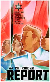
Is Totalitarian Postmodern the latest in design trends? It may well be, since visual styles usually go hand in hand with the political realities of the day. This prime example of a totalitarian postmodernist poster was recently spotted on trains and train stations in the Washington, DC area.
Reminiscent of the propaganda posters issued by the regimes of Hitler’s Germany and Soviet Russia, the authoritarian looking placards were apparently issued as public service announcements by The MARC Train Service. The posters read, “Report any unusual activities or packages to the nearest conductor – Watch, Ride and Report.”
The poster depicts train riders steadying themselves in their seats, holding on to safety straps and poles, but the style of the artwork is also a direct reference to the politically charged Soviet posters of the late 1930’s. The train riders even appear to be holding red flags, but instead of a slogan like “Long live the great unity of the working people of the world” the poster instead calls on viewers to “Report any unusual activities.” Such wording conjures up George Orwell’s, 1984. In that tale of a horrifying modern dystopia, constant surveillance of the population by the one-party state was the order of the day, with the populace encouraged to spy on and inform against itself.
In 2002 a similarly Orwellian poster was issued in London by the Metropolitan Police working with the CCTV, London’s mass transit provider. That unnerving poster bore the slogan, Secure Beneath The Watchful Eyes – the watchful eyes of the police of course, and the poster confronted rapid transit users all across the city.
It is interesting to contemplate how the Watch, Ride and Report poster was sanctioned by The MARC Train Service to begin with. No doubt an advertising agency was used to create and print the artwork, which entailed artists and designers, copy writers, proof readers, editors and of course department managers who would approve the work as it progressed. Finally, the poster had to be approved by MARC and its managers and directors. And yet, while passing through all of those hands not a soul objected to the blunt authoritarian style of the artwork.
Despite totalitarian postmodernism using in tongue-in-cheek commercial advertising techniques, what makes the MARC Train Service poster different is that it offers no irony or humor. Instead it is a serious poster concerning public safety measures and law enforcement in a time of color coded terror alerts, increased FBI powers, and Homeland Security surveillance.
That a people professing allegiance to democracy and human rights could be comforted through the use of aesthetics utilized by dictatorial regimes should be a cause for concern, but then, we live in exceedingly bizarre times. The totalitarian postmodernist style is not restricted to announcements from the public sector. As I mentioned previously, it is a deeply rooted aesthetic in modern commercial advertising, though it does not always have such an obvious political veneer.
An excellent example of this would be a billboard I saw on a heavily trafficked boulevard in Los Angeles just prior to 9-11. The huge billboard was an advertisement for a major department store, and I regret not having taken a photo of the offensive display. The gigantic minimalist ad featured nothing but bold white text centered on a unadorned green background, with the store logo tucked away in a corner. The billboard read, SHUT UP AND SHOP. But that’s the subject of another essay.

